Monday, 24 March 2014

Good grief, sweet prince!


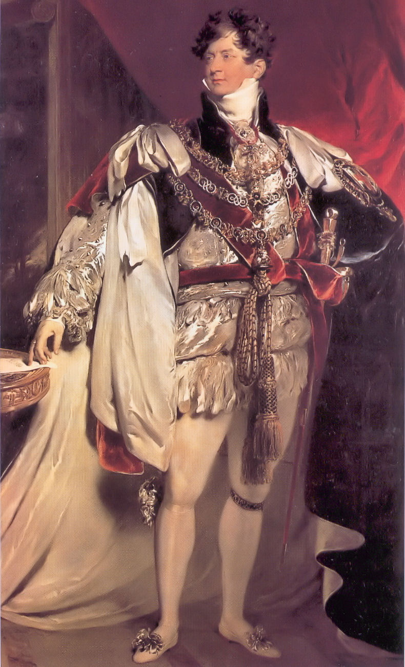
Both the pub and the street on which it sits are named in commemoration of a visit to Cambridge by George IV in November 1815, while still Prince Regent – this despite the fact that he got no closer to the centre than Barnwell, and that was only to change horses, a sidestep which the elders of the Corporation presumably didn’t take as a snub.

Like so many pubs already, it has fallen victim to the latest round of Greene King’s rather characterless (I’m being as polite as I can) rebranding operation. Up until 21 March 2014 it bore this sign.


Based on the coronation portrait by Sir Thomas Lawrence (by which time he was, of course, King George IV, no longer Prince Regent, but we’ll overlook that small detail), it was colourful, easily identifiable from a distance, and eye-catching, like any good pub sign should be.

It’s now been replaced by this . . . creation, which is none of those things:


More suitable for a trendy wine bar than a pub, I’d say. Which might actually be more to Georgy-Porgy’s taste, come to think of it.

Sunday, 16 March 2014

How tickled I am


A feather, you see. For tickling with. Oh, my aching sides . . .

(Actually I do quite like this one. I don't have a problem with canting per se. And given what they could have gone for instead . . .)

Tuesday, 14 January 2014

Arms and the (wrong) earl


This is another pub to ‘benefit’ from Greene King’s latest brand refresh. I have already written about the previous sign, which (correctly) displayed the arms of the Villiers family, earls of Clarendon (2nd creation).


As I noted before, this is an appropriate choice of image because 4th Earl, George Villiers, was not only a distinguished contemporary politician and diplomat, but a Cambridge man, to boot!

Come the refresh, though, it seems that these arms weren’t picturesque or fancy enough, so they went in search of something else, finding instead the arms of the Hoyles, earls of Clarendon (1st creation).

This earldom has been  extinct since 1753 (long before the pub was built) and, after the future 1st earl, Edward Hyde,  was rejected as undergraduate by Magdalen (as the spelling then was) and ended up at Magdalene in the Other Place, they have had no connection whatsoever to do with either the pub or indeed Cambridge as a whole.

And what detailed heraldic research has gone into representing this blazon? Why, search the internet and nick something, of course! (Compare the lettering on the scroll and the 'drop shadow' on the ineschutcheon and the chevrons: this is clearly a reuse of the same image. I did wonder why I could never get it to look sharp in a photograph; now I know.) St George’s Chapel, Windsor, eh? I wonder if anyone at GK read the copyright notice:
“No image or text displayed on this site may be used without the express permission of the owner. Such permission should be sought in the first instance in writing from the Dean & Canons of Windsor, via the Chapter Clerk, who will contact the owner of any photography in question.”

Monday, 13 January 2014

Arms and the Duke


The Duke of Wellington, Willingham

As the cold wind of a rather tacky and plasticky branding refresh sweeps through the Greene King estate, the Duke of Wellington gets a spanking new sign. Even though it’s not called the Wellington Arms, they’ve gone for a nice heraldic job, being the arms of the eponymous Arthur Wellesley, 1st Duke of Wellington:

It’s very full and detailed. And also looks pretty much identical to the image on Wikipedia, even down to the shading. I do hope no copyright has been breached. . .

Burke’s Armory[1] gives the blazon thus

Arms: Quarterly, 1st and 4th gules. a cross argent between five plates in saltire in each quarter, for Wellesley; 2nd and 3rd, or, a lion rampant gules [armed and langued azure][2], for Colley; and as an honourable, in chief an inescutcheon charged with the crosses of St George, St Andrew, and St Patrick conjoined, being the union badge of the United Kingdom of Great Britain and Ireland.
Crest: Out of a ducal coronet or, a demi-lion rampant gules holding a forked pennon flowing to the sinister also gules one-third per pale from the staff argent charged with the cross of St George.
Supporters: Two lions gules eacge gorged with an Eastern crown and chained or.
Motto: Virtutis Fortuna Comes

The inescutcheon was awarded as an augmentation in honour of Wellington’s military successes, especially his famous victory at Waterloo.[3]

Previously the sign bore this rather nice image of the man himself, based on an 1818 portrait by Sir Thomas Laurence (albeit with a different colour background and reversed, for some reason best known to the signpainter).


To my mind it seems a bit odd to use a depiction of the arms on a sign if the pub isn’t itself called the So-and-so Arms, but it could have been so very much worse.

Refs:
[1] Burke, Sir Bernard, 1884, The General Armory of England, Ireland Scotland and Wales, p. 1089.
[2] Added, for completeness’ sake, from Brooke-Little, J.P., 1978. Boutell's Heraldry.

[3] Fox-Davies, A.C., 2007. A Complete Guide to Heraldry, p. 594.

Thursday, 18 July 2013

A tree with a view


A reminder that those lovely people at Greene King did once know what a proper pub signboard should be like. (That is, not like this cheap-looking tat.) Unfortunately, the pub itself, and therefore even more so the signboard, is under threat, GK having put it on the market freehold. Let’s hope the locals are able to rally round and save it.

As for the sign, I have no idea whether the artist had a particular view or scene in mind, although one of the chaps sat outside the pub when I took the picture suggested that the background looked a bit like the view from Lose Hill to Mam Tor in Derbyshire. There is a certainly a slight similarity, but I’d have thought that the tree – and the boy climbing it – would be somewhat out of place in that landscape.

Thursday, 2 May 2013

What the blazes?!?!?


The Rock (Hotel), Cherry Hinton Road, Cambridge

Yet another makeover for the Rock.

This cheap-looking identikit piece of tat is, it would seem, the delightful new branding for GK’s ‘family friendly pub concept [sic], Flame Grill’. Sounds ghastly . . . A rich heritage of decorative and individual pub signboards cast aside in the interests of The Brand (and a crap one, at that).

OK, the previous signage at the Rock wasn’t much cop to start with, but the same fate is threatened for the Green Dragon, Chesterton, which would be a thoroughly unforgivable piece of cultural vandalism. Watch this space.

Uninspiring, insipid, bland, characterless . . . as a Camra colleague put it: ‘If I saw a pub sign like the one at the Rock I'd assume it was a temporary one until they got a decent one done.’

Quite.

Wednesday, 6 February 2013

Dis-arming

The Alexandra Arms, Gwydir Street, Cambridge

Reopened on 30 November 2012 after a rather fine refurbishment, including, of course, a spanking new signboard. Recently its name had been abbreviated – rather discourteously in my view – to The Alex, but now its full name has been officially restored: the Alexandra Arms. Arms.
That’s ARMS. As in ‘coat of’.
As were depicted in the previous sign, which was one of Greene King’s finer efforts.
The new sign, however, looks like this:
That’ll be a sort of portrait, then. Not a coat of arms. Nor even her actual arms. At all. This seems odd to me.
That said, I like this sign a lot, because it is unusual: I can’t think of any other pub signboards based on postage stamps except the odd one using a Penny Black for Queen Victoria. But this is even more unusual because British stamps during Alexandra’s lifetime bore only the image of the reigning Sovereign, so you wouldn’t expect to find a picture of her on a stamp at all.
Elsewhere in the Empire they were not so fastidious, and this image is taken from a 10c stamp from the Dominion of Newfoundland,[1] issued in 1911 to commemorate the coronation of her son, George V. The portrait used for the engraving seems to be derived from this photograph, the inversion and simplification presumably being introduced during the engraving process. Note the very high collar, reportedly worn to conceal a scar from a childhood injury. This, of course, became instantly fashionable – the ‘Diana haircut’ of its day.
So, it’s a good signboard, even if not heraldic. I hope the old one didn’t end up in a skip.
-----------------
[1] Specifically, judging by the tears on the perforations, this very one – yep, it’s another of those ‘found it on the Internet’ images.