Showing posts with label cambridge pubs. Show all posts

Friday, 21 November 2014

Inside only, no standing on top


Tram Depot, Dover Street, Cambridge 

Back in the late 1980s, Suffolk brewery Earl Soham took over the derelict stable block of the long-defunct Cambridge Street Tramways depot, renovated it, and turned it into a pub. What an excellent way of giving new life to neglected part of Cambridge’s heritage! (In these less enlightened times a quarter of a century later the site would probably be cleared and a monstrously insensitive and incongruous seven-storey office block would spring up in its place.) Although sadly no longer an Earl Soham house (it was taken over a few years later by Everards), the pub still has an attractive sign, appropriately featuring a horse-drawn tram, whose design has survived at least one replacement.
Tram Depot: previous sign

Tram Depot: current (2014) sign
Attractive, distinctive, eye-catching and appropriate to the building – an approach that a certain other brewer could learn from.

But. (Yes, there’s always a ‘but’.)

Is it a Cambridge tram?

Well, unfortunately, no, it isn’t. There are several clues, not least the leafy rural setting, which bears no resemblance to any part of the actual tramway. This I can put down to artistic licence and not think too much more about it, but some other inaccuracies are less easy to brush aside:
  • Cambridge Street Tramways livery was red and cream, not this sort of coffee-and-cream affair.
  • The tram car depicted here is being drawn by two horses. This was true of the competing omnibuses of the time, but aside from a brief experiment in the late 1880s, in response to widespread concerns about the welfare of the horses, all CST trams were drawn by a single horse.
  • CST tram no. 5 was a single decker.

So, a commendable effort in the true spirit of what a painted pub sign should be like, but as is so often the case, the execution is let down by an absence of research.

References
Paul Carter, Cambridge 1. The Prestige Series. Glossop: Venture Publications, 2004.
Leslie Oppitz, Tramways Remembered: East Anglia, East Midlands and Lincolnshire. Newbury: Countryside Books, 1992.
S. L. Swingle, The Cambridge Street Tramways. Locomotion Papers No. 61. Lingfield: Oakwood Press, 1972.

Monday, 24 March 2014

Good grief, sweet prince!


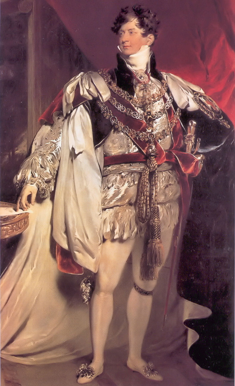
Both the pub and the street on which it sits are named in commemoration of a visit to Cambridge by George IV in November 1815, while still Prince Regent – this despite the fact that he got no closer to the centre than Barnwell, and that was only to change horses, a sidestep which the elders of the Corporation presumably didn’t take as a snub.

Like so many pubs already, it has fallen victim to the latest round of Greene King’s rather characterless (I’m being as polite as I can) rebranding operation. Up until 21 March 2014 it bore this sign.


Based on the coronation portrait by Sir Thomas Lawrence (by which time he was, of course, King George IV, no longer Prince Regent, but we’ll overlook that small detail), it was colourful, easily identifiable from a distance, and eye-catching, like any good pub sign should be.

It’s now been replaced by this . . . creation, which is none of those things:


More suitable for a trendy wine bar than a pub, I’d say. Which might actually be more to Georgy-Porgy’s taste, come to think of it.

Thursday, 2 May 2013

What the blazes?!?!?


The Rock (Hotel), Cherry Hinton Road, Cambridge

Yet another makeover for the Rock.

This cheap-looking identikit piece of tat is, it would seem, the delightful new branding for GK’s ‘family friendly pub concept [sic], Flame Grill’. Sounds ghastly . . . A rich heritage of decorative and individual pub signboards cast aside in the interests of The Brand (and a crap one, at that).

OK, the previous signage at the Rock wasn’t much cop to start with, but the same fate is threatened for the Green Dragon, Chesterton, which would be a thoroughly unforgivable piece of cultural vandalism. Watch this space.

Uninspiring, insipid, bland, characterless . . . as a Camra colleague put it: ‘If I saw a pub sign like the one at the Rock I'd assume it was a temporary one until they got a decent one done.’

Quite.

Wednesday, 6 February 2013

Dis-arming

The Alexandra Arms, Gwydir Street, Cambridge

Reopened on 30 November 2012 after a rather fine refurbishment, including, of course, a spanking new signboard. Recently its name had been abbreviated – rather discourteously in my view – to The Alex, but now its full name has been officially restored: the Alexandra Arms. Arms.
That’s ARMS. As in ‘coat of’.
As were depicted in the previous sign, which was one of Greene King’s finer efforts.
The new sign, however, looks like this:
That’ll be a sort of portrait, then. Not a coat of arms. Nor even her actual arms. At all. This seems odd to me.
That said, I like this sign a lot, because it is unusual: I can’t think of any other pub signboards based on postage stamps except the odd one using a Penny Black for Queen Victoria. But this is even more unusual because British stamps during Alexandra’s lifetime bore only the image of the reigning Sovereign, so you wouldn’t expect to find a picture of her on a stamp at all.
Elsewhere in the Empire they were not so fastidious, and this image is taken from a 10c stamp from the Dominion of Newfoundland,[1] issued in 1911 to commemorate the coronation of her son, George V. The portrait used for the engraving seems to be derived from this photograph, the inversion and simplification presumably being introduced during the engraving process. Note the very high collar, reportedly worn to conceal a scar from a childhood injury. This, of course, became instantly fashionable – the ‘Diana haircut’ of its day.
So, it’s a good signboard, even if not heraldic. I hope the old one didn’t end up in a skip.
-----------------
[1] Specifically, judging by the tears on the perforations, this very one – yep, it’s another of those ‘found it on the Internet’ images.

Friday, 24 August 2012

One for sorrow . . .

Not only does this fine back-street local have the best-kept beer in Cambridge (in my not at all humble opinion), it also has a most interesting two-sided signboard:

Live & Let Live, north-facing side of signboard


Live & Let Live, south-facing side of signboard


The signature and date reveal that it was painted in 1987 by one G. Jones, and is a copy of the last known sign of a pub called The Man Loaded With Mischief, which once stood on Madingley Road. The original sign, painted by local artist and prolific inn sign painter Richard Hopkins Leach, now resides in the Museum of Cambridge (formerly the White Horse Inn) on Castle Street.


(Unfortunately it's presently fixed flat against the wall so there is no way of telling whther this also had a different design on the reverse.)
But what strange thing is depicted? Well, the theme is an old one, of a miserable-looking man laden with a magpie (harbinger of misfortune), a monkey (think of the phrase ‘a monkey on your back’) and a gin-swilling wife. The most frequently cited source is a sign believed to have been painted for an inn of that name on Oxford Street, London, possibly by Hogarth:
This is clearly very closely related to a wonderful print published by Robert Sayer in 1766, entitled A Man Loaded with Mischief, Or Matrimony: A Monkey, a Magpie, and Wife; is the True Emblem of Strife. ‘Drawn by Experience; engraved by Design.’ The Library of Congress describes it thus:
“Print shows a man chained to wedlock carrying a woman on his back, her breasts exposed, she holds a cup labeled ‘gin’ and toasts ‘My Bucks Health’, and according to a pig in a pen, ‘She is as Drunk as David's Sow’; a monkey sits on the woman's lap, removing the man's wig, and a magpie sits on the monkey's shoulders. In the background is a building (probably a brothel) with horns mounted above a sign showing two cats and labeled ‘The Christian Mans Arms or the Cuckolds Fortune.’ Includes six lines of verse.”
The British Museum holds another, more rugged, take on the same theme, in a print from c.1750 to 1768, which bears a much closer resemblance to another said to date from 1752 than the perhaps more genteel images in which the lady is at least wearing a hat and is able to sit upright!

The artist John Crome also produced a version, so the image (or the sentiment it expressed) was clearly popular at the time.

There are some other examples, for example the Load of Mischief, Blewsbury. The Michief, Norwich also once had a version, but recently has gone for something less misogynistic (it's Political Correctness gone mad, I tell you!).

It even travelled across the Pond: in Philadelphia there is (or was) the Man Full of Trouble, dating from 1759.

The original seems to be an engraving in a book (scroll to p. 249) published in 1653 by Dutch poet and humorist, Jacob Cats.

Anyway, where better for such a poor, downtrodden bloke to find refuge from the causes of his burdensome strife than the pub?

Wednesday, 30 May 2012

When all this was fields (2)


I’m not sure whether this thing (is it actually impressionist, or is it just very poorly reproduced by GK's normally oh-so-thoughtful sign producers?) was chosen to represent the idyllic past of the area in which this now closed and not much missed boozer sits, but Arbury sure as hell don’t look like that anymore!

Friday, 20 April 2012

Towering achievement

There are eleven Pantons listed in Burke’s General Armory of England, Scotland, Ireland, and Wales, some differenced versions of others, but none of them an exact match for what we have here. One corresponds in some parts, however. It is given as follows:
‘Per chev. gu. and or, in chief two towers ar. in base a lion ramp az. Crest: A lion couchant, the tail between the hind legs, az. bezantée.’
So the shield would look like this:
(Image created by me using software from www.inkwellideas.com/coat_of_arms.)
Close, but some simple errors (e.g. reading the chevron as a charge rather than a division), which leads me to suspect that whoever drew up the original design for this signboard misread or misinterpreted the blazon.
And does it have anything to do with the pub? I very much doubt it. The ‘Arms’ bit of the name seems a late and aggrandising addition (cf. the Kingston Arms) for what was once the Panton Brewery tap. The brewery itself gets its name from the street on which it sits, which was in turn named after one ‘Polite’ Tommy Panton, son of Thos. Panton (chief groom or equerry to King George II). In 1806 Tommy was instrumental in getting Parliament to pass the Barnwell Enclosures Act, which allowed this area of Cambridge to be developed. (See the History of Gwydir Street for more.) But I would be very surprised if he was an armiger, and even more surprised if these were his.

Wednesday, 14 March 2012

Hurley-Burleigh/Burley

So. You’re a brewery who has just acquired a pub from pubco that needs to realise some of its assets by selling off some of its property portfolio estate. Obviously you’ll want to put your shiny new branding on it, and that includes, hopefully, an impressive signboard that represents your brand values. But what to have on it? Well, often the name of the pub itself will suggest a pretty obvious theme, and you’ve already provided a fine sign for another pub in the town only three or four years ago, so you have a pretty good idea what to do.
Now, do you go to the trouble of maybe doing a bit of research to see what’s appropriate, and then commissioning a signwriter to come up with something special? Or do you just reproduce something you find on the Internet?
Here's the new sign. Which approach do you think they took?


(Here’s a clue.)
Yep, it’s a direct lift from one of those ‘your family crest’ companies that I have commented on before (those ghastly scrolls give the game away). And as before, it is an unfortunate choice.[1]
Checking with a more authoritative source reveals that these arms (vert three boars heads couped argent armed or) belong to a Burley (note the spelling), from Leicestershire and Wiltshire. So (needless to say) it has nothing to do with the Burleigh in question here, who was a certain James Burleigh, a prominent local landowner and carrier in the late 18th century (and of course no armiger). Burleigh Street, on which the original Burleigh Arms once stood, is named after him (incidentally, its continuation, Norfolk Street, is named after his father-in-law, William Norfolk, who was mayor of Cambridge in 1769).
It wouldn’t have taken very much effort to have done this much better.
[1] I do hope, incidentally, that the proper channels were gone through and permission to reproduce was granted (for the appropriate fee) – those American copyright lawyers can get pretty nasty.
References
Ronald Grey and Derek Stubbings, Cambridge Street-names: Their origins and associations, CUP, 2000, pp. 55f.

Thursday, 23 February 2012

When all this was fields. . .

Looking at it now, it's strange to think of Chesterton as a rural idyll. Yet even by the time this pub was built, in the middle of the 19th century, the rural nature of Chesterton was beginning to turn suburban following inclosure in 1836 and the subsequent influx of ‘townies’ from Cambridge. So the name of the Haymakers, and of the Wheatsheaf which used to stand on the corner opposite, were already harking back to a ‘lost’ age.  
As well as providing a popular (albeit often ersatz) name for a pub, images of haymakers resting (or sometimes frolicking) after a long day working (or sometimes frolicking) in the fields have long been a popular theme amongst artists. The scene on this sign is based on La Charette by Louse Le Nain (1600–1648).

Tuesday, 21 February 2012

‘The moon, like to a silver bow’


The Half Moon Inn, Little St Mary’s Lane, Cambridge

The Half Moon hasn’t been a pub for many years, long before my time in Cambridge, and I didn’t even know about it until about a year ago, when I began my quest for Cambridge’s ‘dead pubs’. The sign still remains, though, a silent witness.* Yet how many times have I walked past it over the years and not noticed?
As a point of historical interest, a pub of this name, a decent three-storey establishment, originally stood on the corner of St Mary’s Lane and Trumpington Street until in 1875 it had to make way for the Emmanuel United Reform Church. Presumably the name just moved down the lane to these smaller premises, which was certainly a pub in 1885.

(*Update: This sign is actually a copy. The original, which is gilded rather than white, sits in a cabinet in the Museum of Cambridge.)


Tuesday, 24 January 2012

Twisted

Yeah, right. Ha bloody ha. I suppose someone was trying to be clever. I won’t waste more words on this.

Thursday, 5 January 2012

Mind your manors!

According to Domesday Book, before the Norman Conquest the manor of [Cherry] Hinton (in which this part of Cambridge once lay) was held by one Edeva the Fair (‘Eddeve pulcra’), who is generally assumed to be Edith Swanneck, wife more Danico of Harold II Godwinson, though the authors of Cambridge Street-names: Their origins and associations propose that it may instead be his sister, Editha, wife of Edward the Confessor. Whichever one of the two it was, after the Conquest she was replaced as lord of the manor by the rapacious Count Alan of Brittany, who did rather well out of the redistribution of land after 1066. So I suppose having a pub named after her some 1900 years later is a small consolation.

Monday, 14 November 2011

Trainspotting

The Engine, Baldock

Now I may be a bit of an anorak about some things (heraldry, beer, pubs spring to mind), but trains aren’t my thing at all. So for this one I had to consult my mate Pete Wiffin, landlord of the Live & Live in Cambridge. Within a split second of seeing the photograph he had identified this as LNER 1306, a Thompson Type B1 locomotive (which I suppose means something to somebody), now bearing the nameplate ‘Mayflower’.

The engine still exists, in LNER livery, as can be seen in this photo, from a similar angle, although this is a little inauthentic as it wasn’t delivered until after nationalisation, and the Mayflower was a different locomotive altogether. Also, given that it saw most of its service in and around Hull and Bradford, I doubt it ever went near Baldock in its working life, but it’s a charming little sign nonetheless. I hope it doesn’t just get lobbed into a skip should Greene King get round to ‘refurbishing’ the place.

Baldock station building itself, viewed from about the same point, now looks like this:


Monday, 31 October 2011

Out with the New (Inn). . .

The very lovely sign that used to hang outside this pub when it was called the New Inn was replaced in the October 2100 refurbishment and rebranding with this.
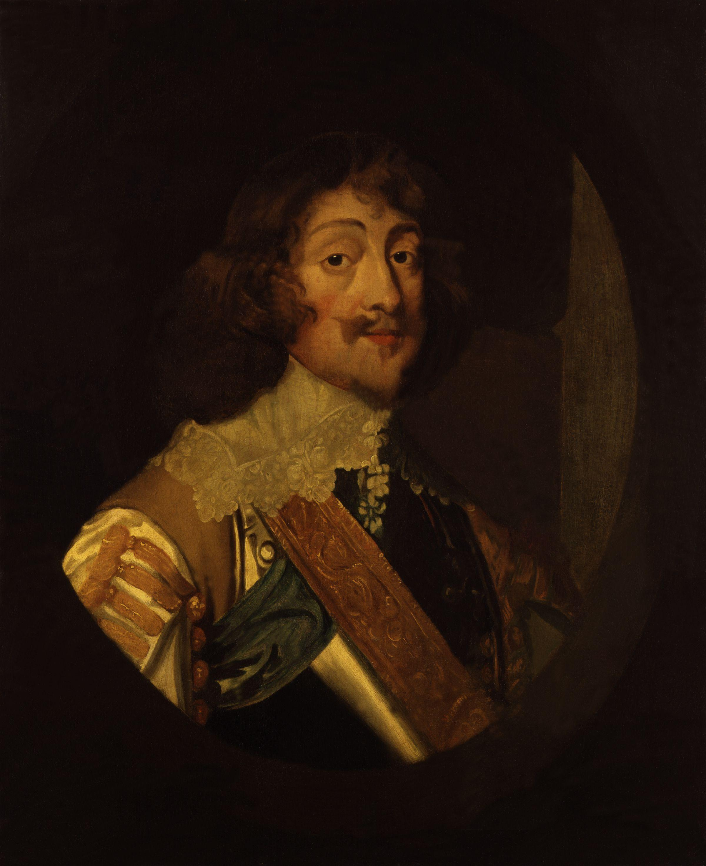
It’s very much in line with GK’s current corporate look, and I spent the rest of the day cursing their philistinism in ditching something interesting for something so bland. However, unlike some of their recent efforts, in itself it’s not all bad as a sign for this establishment.
You see, the chap depicted here actually has a connection with the building. He is Henry Rich, 1st Earl of Holland (this image based on a portrait by Van Dyke). On 10 July 1648 he was leader of a small Royalist force that was camped in the market square. They were surprised and defeated by a group of Roundheads crossing the bridge, Henry himself being captured in this very inn where he had spent the night. His ghost is said to haunt the building.
So, although I lament the loss of a particularly interesting sign (I hope it found a good home, and was not just tossed carelessly into a skip), at least its replacement shows a little research and relevance to the building from which it hangs.

Wednesday, 5 October 2011

It's just not cricket!

For many years, possibly since about 1840 (although the earliest reference in a directory that I have found is in 1852), the pub on the corner of Melbourne Place and Prospect Row has been known as The Cricketers (Inn), the name obviously relating to nearby Parker’s Piece, a 25-acre green famous in the mid 19th century as, amongst other things, a cricket ground.[1]
Most recently it had nice, colourful, eye-catching sign:

Those who remember the old ‘Charles Dickens’ £10 note (in circulation from 1992 until 2003) might recognise it: the cricket match between the Dingley Dellers and All Muggleton in Chapter 7 of The Pickwick Papers.
However, before it was known as The Cricketers, it was known as The First and Last – certainly a pub of that name on Prospect Row is listed in Robson’s Commercial Directory of 1839 (it is said that the pub was built in 1838), but not in any subsequent directories. At the time, that would not be an unreasonable name, as the eastward expansion of Cambridge had not reached much further than that, aside from a small development where the Grafton Centre now sits, and it would be the first or last public house arrived at in that direction.[2]
It seems a rather less apt name now, in 2011, when it’s right in the middle of a web of streets forming part of the ‘Kite’ and there are other pubs close by in all directions, but that is what it has just been renamed as in its recent refurbishment. The minds of branding consultants move in mysterious ways. . .
Of course, with a refurbishment and a new name comes a new sign. This ‘thing’:
Now, that may look nice on a wall with beers, food menu or forthcoming attractions noted on it in chalk, or even as a place mat, given the new emphasis on the dining experience; but it’s hardly eye-catching from a distance – not so much a pub signboard as an empty blackboard on a pole. The only thing it's likely to be first in is a competition to find Cambridge’s Boringest Pub Sign.
Sorry Greene King, but that’s another great big FAIL.
References:
[1] Gardner’s History, Gazetteer & Directory of Cambridgeshire, 1851, p. 182. As well as cricket, it is worth noting, undergraduates of the university were also playing ‘football’ on the Piece at about this time, the Cambridge Rules of 1848 forming the basis of what later became Association Football.
[2] See Baker’s Map of the University and Town of Cambridge, 1830.

Friday, 12 August 2011

Imperial Travesty

After being known as the Globe since at least 1869, this pub gained a new name when it joined the same stable as the Empress in late 2010. Nothing wrong with pubs changing their name, of course – well, so long as the new name is appropriate and not silly. (Slug and Lettuce, anyone? No, thought not.) And I can see why the new ‘brother’ pub of the Empress should be renamed to mark its adoption, even if it’s not as venerable a pub name as the Globe.
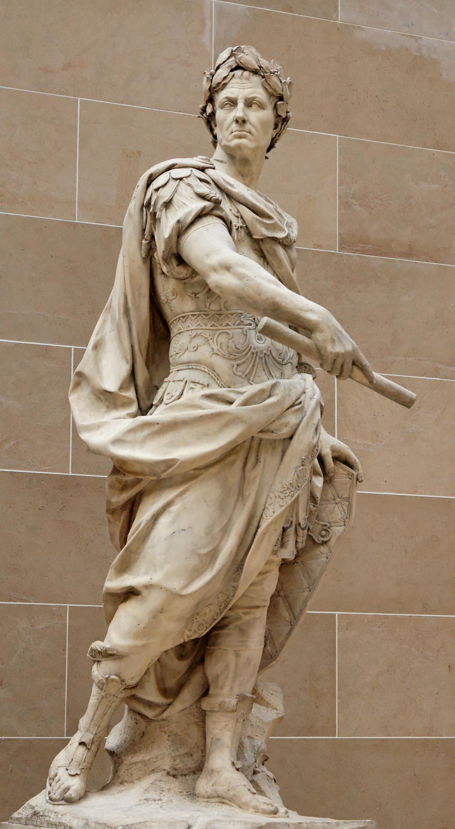
So, which emperor to choose? Well, as the Empress takes its name from Queen Victoria, Empress of India, her successors might be good candidates. But aside from George V, who actually went to India to be crowned Emperor, none have particularly ‘imperial’ associations to the modern mind. There is the Emperor Napoleon, of course, but that probably wouldn’t go down too well. Probably someone Roman, then, they had emperors, didn’t they? How about this one?
This is a fancifully flattering statue of Julius Caesar by Nicola Coustou (9 January 1658 – 1 May 1733), now in the Louvre. Everyone knows about Julius Caesar, don’t they? Veni, vedi vici, invaded Britain, Gallia est omnis divisa in partes tres, knobbliest Roman of them all, et tu, Brute, ‘Infamy, infamy, they’ve all got it in for me’ and all that. He’ll be ideal, won’t he?
One teeny-weeny problem, though: Julius Caesar was never emperor. (He may have been granted the title ‘imperator’, but that is not the same as our understanding of the word ‘emperor’.)
Oh, and I always thought that the imperial colour was purple, not this horrendous green.

Oops Acropolis!

The Bath House (formerly The Bath Hotel) sits in a Grade II listed 17th-century building, with reworked 18th-century frontage. So when Greene King decided to replace the former generic signboard, it must have seemed so obvious to go for something classical – this is Cambridge, after all. Perhaps a Roman bath, then?
Not a bit of it. What we actually have is this:
It’s a detail from the south-east corner of the temple of Athena Nike on the Athenian Acropolis. Not a bath-house, not Roman, and nothing to do with the building or Cambridge whatsoever.
If (polite) words failed me about the Hippodrome, March, I am left completely speechless by this idiocy.

Monday, 4 July 2011

County doesn't seem to matter after all

An update to the very first post on this blog, about the sign that started it all off. Because there is a new one:
I’m not very impressed with it. First, gone is the old Arms of the old county on the bracket, to be replaced by some rather clunky Everards branding. Admittedly it was looking more than a little weather-beaten, but I know which of the two I would rather have on there.
Then there’s the picture itself:
This looks like a fairly faithful reproduction of what was there before, except that the colours have changed, and become more intense. This means that what should be yellow (Or) is now more of a Dale Winton orange, which is not an heraldic tincture. And the crossed keys around the neck of the dexter supporter should be silver (Argent) and gold (Or), although that was wrong in the previous sign as well.

Small details, perhaps. But would Everards be so cavalier if it were the Arms of Leicestershire CC rather than Cambridgeshire?

Thursday, 19 May 2011

Berks’ heraldry

I’m sure most people have encountered those business that peddle items emblazoned with ‘your family coat of arms’, determined purely by surname, not by any genealogical research. With the Court of Chivalry no longer sitting, this can be regarded as a harmless bit of fun, appealing to the gullible and the heraldically ignorant (online ones particularly aimed at the American market, it seems, about which I make no further comment) – but on no account should they or their dubious claims be taken seriously.
The Kingston Arms currently has this on its signboard.
When I first saw it, I was puzzled. ‘What has the Duchy of Brabant to do with this pub?’ I wondered. But a little searching reveals that it’s nothing to do with the Low Countries at all: a number of these ‘family heraldry’ companies offer this as the coat of arms belonging to the surname Kingston. No pedigree, no genealogy, just the shield: sable a lion rampant or.
But does it have anything to do with the pub?
Of course not! It took a little intelligent digging (more than went into the selection of this device for the pub, obviously), but I finally found out that the Kingston family entitled to bear these arms were lords of one of the manors of Kingston Bagpuize in far-away Berkshire (Oxfordshire since 1974). The line became extinct in 1515 and the manor was sold out of the family in 1545. Well, at least there’s no one alive to challenge the appropriation of their arms.
The Kingston from whom the street and the pub take their respective names was in fact one Thomas Kingston, known locally as ‘Miser’ Kingston, who owned houses in nearby Sleaford Street. He wore shabby clothes, had a long beard, and frightened children, apparently. He also had a reputation for watering the farm workers’ beer, which is not really the sort of reputation that a self-respecting pub would want to associate itself with, but there you go.
He was not, however, an armiger, so the very name of the pub is a bit fake to start with, a fakery which the present sign compounds.
References
Gray, R., and D. Stubbings, Cambridge Street-names: Their origins and associations. CUP 2000

Wednesday, 18 May 2011

Couldn’t give it away


According to the pub’s web site, ‘The pub got its name from when part of it was a printing press which circulated a free Cambridge newspaper. Unfortunately for them it lasted one issue, but the name survived.’
Exactly when this was it doesn’t say, but there has been a pub on this site, apparently of that name, since at least 1851 (Gardner’s Directory).