Showing posts with label cambridgeshire. Show all posts

Monday, 15 June 2015

Pigs (Three Different Ones)


Flying Pig, Hills Road, Cambridge

Having been known as the Crown for most of its life (apart from one brief period when it was renamed the Engineer, presumably to attract custom from the workers at the nearby railway station), this 1830s-ish pub was renamed the Flying Pig in the late 1980s by the then proprietor – and amateur pilot – Mick the Pig.

Naturally a new name means new signage, which included this distinctive signboard.


By 2010, however, it was becoming rather weather-beaten and was in danger of becoming the ‘Fallen on Some Poor Soul’s Head Pig’, so it was removed and eventually, in April 2011, replaced by this eye-catching double-sided job, the work of Mr Penfold:


Here beer here? Hear, hear!

(Update: Well, wouldn't you just know it: as soon as I finally get round to blogging about this sign, it gets taken down because it's too heavy for the bracket. Replacement sign in due course: watch this space (or another one).)

Friday, 16 January 2015

Ringing the changes


A quick note about a couple of new bell-related signs.

First, Burwell. As is the case with most pubs with the word ‘bell’ in their name, the Five Bells stands close to the parish church, the stunning St Mary’s, which Pevsner describes as ‘[t]he most perfect example in the country of the Perp[endicular] ideal of the glasshouse’. And it did indeed have a peal of five bells from c.1709 to 1955, when three further trebles were added, so the pub is rightly named. It got a new sign over the summer.


On the left is the sign that graced the Five Bells until about August 2014. A fairly tradition motif, nicely arranged and executed. The new sign on the right, apparently designed by the current licensee, is anything but traditional, an inventive idea of nesting the bells Russian-doll style. I gather opinion in the village is mixed. I think it’s quite a clever idea, and it’s certainly eye-catching, but I can see why others might not like it much.
Back in Cambridge the Six Bells has also finally been visited by GK’s branding facelift pixies. The new sign, as of January 2015, is on the right, another traditional treatment like the old sign at Burwell, t bells arranged symmetrically and linked by a charming ribbon. Inoffensive, and it could have been a whole lot worse. But I have a soft spot for the more unusual sign it replaced, with shiny new bells sitting in he foundry. I hope it’s been kept safe.


As for the name, well, there isn’t a church, with bells or otherwise, anywhere near the place, nor was there when the pub first appeared in the 1830s, and at no time since, so this one’s a complete mystery. If anyone knows, do get in touch!

Friday, 21 November 2014

Inside only, no standing on top


Tram Depot, Dover Street, Cambridge 

Back in the late 1980s, Suffolk brewery Earl Soham took over the derelict stable block of the long-defunct Cambridge Street Tramways depot, renovated it, and turned it into a pub. What an excellent way of giving new life to neglected part of Cambridge’s heritage! (In these less enlightened times a quarter of a century later the site would probably be cleared and a monstrously insensitive and incongruous seven-storey office block would spring up in its place.) Although sadly no longer an Earl Soham house (it was taken over a few years later by Everards), the pub still has an attractive sign, appropriately featuring a horse-drawn tram, whose design has survived at least one replacement.
Tram Depot: previous sign

Tram Depot: current (2014) sign
Attractive, distinctive, eye-catching and appropriate to the building – an approach that a certain other brewer could learn from.

But. (Yes, there’s always a ‘but’.)

Is it a Cambridge tram?

Well, unfortunately, no, it isn’t. There are several clues, not least the leafy rural setting, which bears no resemblance to any part of the actual tramway. This I can put down to artistic licence and not think too much more about it, but some other inaccuracies are less easy to brush aside:
  • Cambridge Street Tramways livery was red and cream, not this sort of coffee-and-cream affair.
  • The tram car depicted here is being drawn by two horses. This was true of the competing omnibuses of the time, but aside from a brief experiment in the late 1880s, in response to widespread concerns about the welfare of the horses, all CST trams were drawn by a single horse.
  • CST tram no. 5 was a single decker.

So, a commendable effort in the true spirit of what a painted pub sign should be like, but as is so often the case, the execution is let down by an absence of research.

References
Paul Carter, Cambridge 1. The Prestige Series. Glossop: Venture Publications, 2004.
Leslie Oppitz, Tramways Remembered: East Anglia, East Midlands and Lincolnshire. Newbury: Countryside Books, 1992.
S. L. Swingle, The Cambridge Street Tramways. Locomotion Papers No. 61. Lingfield: Oakwood Press, 1972.

Sunday, 16 March 2014

How tickled I am


A feather, you see. For tickling with. Oh, my aching sides . . .

(Actually I do quite like this one. I don't have a problem with canting per se. And given what they could have gone for instead . . .)

Monday, 13 January 2014

Arms and the Duke


The Duke of Wellington, Willingham

As the cold wind of a rather tacky and plasticky branding refresh sweeps through the Greene King estate, the Duke of Wellington gets a spanking new sign. Even though it’s not called the Wellington Arms, they’ve gone for a nice heraldic job, being the arms of the eponymous Arthur Wellesley, 1st Duke of Wellington:

It’s very full and detailed. And also looks pretty much identical to the image on Wikipedia, even down to the shading. I do hope no copyright has been breached. . .

Burke’s Armory[1] gives the blazon thus

Arms: Quarterly, 1st and 4th gules. a cross argent between five plates in saltire in each quarter, for Wellesley; 2nd and 3rd, or, a lion rampant gules [armed and langued azure][2], for Colley; and as an honourable, in chief an inescutcheon charged with the crosses of St George, St Andrew, and St Patrick conjoined, being the union badge of the United Kingdom of Great Britain and Ireland.
Crest: Out of a ducal coronet or, a demi-lion rampant gules holding a forked pennon flowing to the sinister also gules one-third per pale from the staff argent charged with the cross of St George.
Supporters: Two lions gules eacge gorged with an Eastern crown and chained or.
Motto: Virtutis Fortuna Comes

The inescutcheon was awarded as an augmentation in honour of Wellington’s military successes, especially his famous victory at Waterloo.[3]

Previously the sign bore this rather nice image of the man himself, based on an 1818 portrait by Sir Thomas Laurence (albeit with a different colour background and reversed, for some reason best known to the signpainter).


To my mind it seems a bit odd to use a depiction of the arms on a sign if the pub isn’t itself called the So-and-so Arms, but it could have been so very much worse.

Refs:
[1] Burke, Sir Bernard, 1884, The General Armory of England, Ireland Scotland and Wales, p. 1089.
[2] Added, for completeness’ sake, from Brooke-Little, J.P., 1978. Boutell's Heraldry.

[3] Fox-Davies, A.C., 2007. A Complete Guide to Heraldry, p. 594.

Thursday, 18 July 2013

A tree with a view


A reminder that those lovely people at Greene King did once know what a proper pub signboard should be like. (That is, not like this cheap-looking tat.) Unfortunately, the pub itself, and therefore even more so the signboard, is under threat, GK having put it on the market freehold. Let’s hope the locals are able to rally round and save it.

As for the sign, I have no idea whether the artist had a particular view or scene in mind, although one of the chaps sat outside the pub when I took the picture suggested that the background looked a bit like the view from Lose Hill to Mam Tor in Derbyshire. There is a certainly a slight similarity, but I’d have thought that the tree – and the boy climbing it – would be somewhat out of place in that landscape.

Wednesday, 14 March 2012

Hurley-Burleigh/Burley

So. You’re a brewery who has just acquired a pub from pubco that needs to realise some of its assets by selling off some of its property portfolio estate. Obviously you’ll want to put your shiny new branding on it, and that includes, hopefully, an impressive signboard that represents your brand values. But what to have on it? Well, often the name of the pub itself will suggest a pretty obvious theme, and you’ve already provided a fine sign for another pub in the town only three or four years ago, so you have a pretty good idea what to do.
Now, do you go to the trouble of maybe doing a bit of research to see what’s appropriate, and then commissioning a signwriter to come up with something special? Or do you just reproduce something you find on the Internet?
Here's the new sign. Which approach do you think they took?


(Here’s a clue.)
Yep, it’s a direct lift from one of those ‘your family crest’ companies that I have commented on before (those ghastly scrolls give the game away). And as before, it is an unfortunate choice.[1]
Checking with a more authoritative source reveals that these arms (vert three boars heads couped argent armed or) belong to a Burley (note the spelling), from Leicestershire and Wiltshire. So (needless to say) it has nothing to do with the Burleigh in question here, who was a certain James Burleigh, a prominent local landowner and carrier in the late 18th century (and of course no armiger). Burleigh Street, on which the original Burleigh Arms once stood, is named after him (incidentally, its continuation, Norfolk Street, is named after his father-in-law, William Norfolk, who was mayor of Cambridge in 1769).
It wouldn’t have taken very much effort to have done this much better.
[1] I do hope, incidentally, that the proper channels were gone through and permission to reproduce was granted (for the appropriate fee) – those American copyright lawyers can get pretty nasty.
References
Ronald Grey and Derek Stubbings, Cambridge Street-names: Their origins and associations, CUP, 2000, pp. 55f.

Thursday, 23 February 2012

When all this was fields. . .

Looking at it now, it's strange to think of Chesterton as a rural idyll. Yet even by the time this pub was built, in the middle of the 19th century, the rural nature of Chesterton was beginning to turn suburban following inclosure in 1836 and the subsequent influx of ‘townies’ from Cambridge. So the name of the Haymakers, and of the Wheatsheaf which used to stand on the corner opposite, were already harking back to a ‘lost’ age.  
As well as providing a popular (albeit often ersatz) name for a pub, images of haymakers resting (or sometimes frolicking) after a long day working (or sometimes frolicking) in the fields have long been a popular theme amongst artists. The scene on this sign is based on La Charette by Louse Le Nain (1600–1648).

Monday, 28 November 2011

Mixed-up prior(it)ies

The Priory, St Neots
St Neots used to have a priory, but this isn’t it: theirs was largely pulled down after the Dissolution and no trace now remains. What adorns this sign is a heavily processed but still identifiable picture of Castle Acre Priory, Norfolk.

Wednesday, 27 July 2011

Through the Looking-Glass


The queen in question is, of course, Victoria, and this sign is based on a portrait of the young queen painted by Sir Frances Grant in 1843.
It’s nicely painted, but for some reason it has been done in mirror image, as the direction of the sash gives away (the Garter sash or riband should be worn over the left shoulder, not the right).

Monday, 4 July 2011

County doesn't seem to matter after all

An update to the very first post on this blog, about the sign that started it all off. Because there is a new one:
I’m not very impressed with it. First, gone is the old Arms of the old county on the bracket, to be replaced by some rather clunky Everards branding. Admittedly it was looking more than a little weather-beaten, but I know which of the two I would rather have on there.
Then there’s the picture itself:
This looks like a fairly faithful reproduction of what was there before, except that the colours have changed, and become more intense. This means that what should be yellow (Or) is now more of a Dale Winton orange, which is not an heraldic tincture. And the crossed keys around the neck of the dexter supporter should be silver (Argent) and gold (Or), although that was wrong in the previous sign as well.

Small details, perhaps. But would Everards be so cavalier if it were the Arms of Leicestershire CC rather than Cambridgeshire?

Wednesday, 15 June 2011

Seeing double

In my last post I commented on a Greene King sign that had had a degree of thought put into it. More often than not, however, especially with common names, they resort to stock images. This means that a number of pubs have more or less identical signs. For instance . . .
OK, there’s no direct route and there’s a river between them, but still, as the crow flies they're barely three-quarters of a mile apart. Didn’t anyone notice?

Tuesday, 7 June 2011

Health to the sign-painter

I like this sign, a lot of thought has gone into it. Which is unusual for Green King.
As I’m sure everyone can recognise, it is made up of elements of William Hogarth’s Beer Street (the slightly less-famous companion to Gin Lane). That in itself is enough to endear it to me, but there’s more to find in the detail.
In the original, although hard to make out, the sign-painter is putting the finishing touches to a sign for an alehouse or tavern called ‘Health to the Barley Mow’, a detail that is preserved in this sign:
However, the picture on the sign is different. In the original, we can just make out a circle of happy farm labourers dancing around a hayrick at the end of a successful harvest, with another ‘reveller’ (as they call them in newspapers these days) standing atop it.
Here we have a rider, who looks to be masked like a highwayman, taking a drink from a stirrup cup from an attending servant.
I presume this is a reference to Dick Turpin: we’re not far from Huntingdon, where he certainly did hang out for a while, and the old Great North Road, scene of his mythical ride from London to York. A number of old inns nearby claim that he used to frequent them, but I can’t find any reference to a claim on the part of this one. It is reputed to be haunted, but not by Turpin.
Some other points in passing. There are two versions of the original print, and the second is the better known. In it, the burley blacksmith is raising in his left hand a haunch of good British mutton or ham. I prefer the first version, in which he is ejecting a scrawny Frenchman! Here he’s just holding a rolled-up piece of paper, for no obvious reason.
The Union Flag flying from the church (St Martin-in-theFields) is the post-1801 version, with the Cross of St Patrick included. Beer Street was published in 1751, and Hogarth died in 1764, so this is a slight anachronism. But that's a very minor quibble in what is otherwise a very captivating and thoughtful signboard.

Update:
Sadly, in October 2011 this most excellent of signs was replaced by this corporate blandness.


Details about this sign here.

Tuesday, 26 April 2011

Take it to the bridge

The Bridge (sometime Bridge Hotel) sits handily next to the bridge over the Cam at Clayhithe. So you’d think their sign might have a picture of said bridge, wouldn’t you? Except . . . Well, it cannot be denied that the present bridge, built in 1939, is not terribly beautiful, so you could understand why that idea might not appeal very much:
Clayhithe bridge, from the south
Instead they’ve gone for this:
It is, as anyone familar with Cambridge will know, the covered bridge over the Cam in St John’s College, known as the ‘Bridge of Sighs’, connecting Third Court and New Court.
It’s the right river, it’s rather more attractive, and it’s only a few miles upstream. But aside from that, does it have anything to do with Clayhithe? Well, surprisingly, yes, it does.
You see, Clayhithe lies within the parish of Horningsea, whose living has been in the patronage of St John’s (then the Hospital of St John) since early in the 14th century. So it might not be quite such a random choice as first appears.
Incidentally, the previous sign looked like this:
Altogether a more characterful effort and, while it doesn’t look like the actual bridge either, it does have a narrowboat, of which there are many phutt-phutting along the river at this point.

Thursday, 21 April 2011

By George!


Spoilt for choice with Georges, really, with six kings and any number of dukes and other aristocrats to pick from. Here Greene King have plumped for something based on a portrait of George II in his coronation regalia by Thomas Hudson, which I suppose is as good a choice as any. Nicely done, anyway.

Wednesday, 13 April 2011

Heir today. . .

The Osborne Arms, Hills Road, Cambridge

This sign was taken down in late 2008, presumably before it fell down onto the head of some poor tippler, and sadly has not been replaced. It shows the arms of the Osborne Baronetcy of Ballentaylor in the County of Tipperary, and Ballylemon in the county of Wexford.
Arms: Gules on a fesse cottised or three* roundels barry wavy argent and azure over all a bend of the third.
Crest: A sea-lion sejant holding in the dexter paw a trident erect proper.
Motto: Pax in Bello (‘Peace amidst War’)
* Only two ever seem to be represented. The third, presumably, is hidden behind the bend.


The baronetcy was created in the Baronetage of Ireland on 15 October 1629 for Richard Osborne. What he or his descendants have to do with Cambridge or the pub I have yet to find out, and I suspect this comes from a casual flick through some heraldic reference book rather than thorough research. But the main point of interest is that the heir apparent to this baronetcy is none other than the present Chancellor of the Exchequer, The Rt Hon. George Osborne MP.

Update (October 2012): Sadly the pub has now been demolished. But I think a better candidate for the eponymous Osborne is Francis Osborne, 1st Baron Godolphin, MP for Cambridgeshire 1810 to 1830. The blazon for him is:

Arms: Quaraterly, first and fourth, quarterly erm. and az. a cross or, for Osborne; second and third, gu. and eagle with two heads displ. betw. three fleurs-de-lis, two and one, ar. for Godolphin

Crests: Frist, an heraldic tiger, statant or, tufted sa. for Osborne; second a dolphin embowed sa. for Godolphin.

Supporters: Two eagles reguard. wings displ. and inverted ar.

Motto: Pax in bello

Source
The British Herald; Or, Cabinet of Armorial Bearings of the Nobility, Thos. Robinson, 1830
Encyclopaedia of Heraldry, or, General Armory of England, Scotland and Ireland, John Burke, 1844.

Monday, 11 April 2011

Hip! Hip! Booooooooo!!! Gerroff the stage!!

The Hippodrome, Dartford Road, March
The Hippodrome is JD Wetherspoon’s new pub, in the former Hippodrome Cinema (hence the name).
Now, as any fule kno (especially if that fule has a good Classical education) a hippodrome is where the Ancient Greeks used to race horses, and especially chariots, although the word is now widely used as a name for a theatre, particularly one specialising in variety rather than ‘serious’ drama.
New pub, new sign. It looks like this:
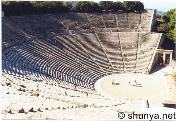
It’s theatre. A Greek theatre, no less. In fact it looks to me extraordinarily like a daubed representation of the magnificent 4th-century BC theatre at Epidauros (been there, recited Sophocles in it – in the Greek, of course). What it most certainly is not, though, is a hippodrome. (Nor is it strictly speaking an amphitheatre, while I’m at it.)


To me this is as daft as calling a pub, say, Aintree, and putting a picture of Anfield or the Liverpool Empire on the sign. It annoys me so much that I am tempted to use Strong Language. But my Mom might read this one day, so I’d better not.
Or maybe I should just get a sense of proportion. . .

Thursday, 31 March 2011

Derby daze

This was the first ‘portrait’ signboard that intrigued me and inspired me to do a little digging. At the time the sign showed this chap:

The Earl of Derby, signboard up to the end of 2010

He is Edward Smith-Stanley, 14th Earl of Derby. Quite an illustrious man, having served as prime minister three separate times. Now he might have been earl when the pub was built, although it’s possible that his father, Edward Smith-Stanley, 13th Earl of Derby (and a Trinity man to boot), might still have been alive. But he (the 14th Earl) was an Oxford man, with no connection with Cambridge.
Another more suitable candidate for the relative immortality of a pub signboard would have been his son, Edward Henry Stanley, 15th Earl of Derby, who was both a Trinity man and a member of the University Commission.


So when the sign was replaced early in 2011, who was it that Greene King’s sign painters decided to honour? Well, the chap they chose (no doubt after much detailed research) looked like this:

The Earl of Derby, signboard 2011
So far as I can work out, he is probably Edward Stanley, 11th Earl of Derby. (I can’t find the original picture that this was taken from, but this sketch looks a lot like him.) It’s a nice, colourful image. But the subject has no connection with Cambridge whatsoever, and was getting on for 100 years dead when the pub was built. Brilliant! Who could be better?
That said, credit where credit is due: at least they’ve stuck with a picture, not rebranded the place as ‘The Derby’ and gone for some fancy lettering on a drab background.

Wednesday, 30 March 2011

This bird has flown

I noticed that this pub had a bit of a makeover recently, which of course meant a change of signboard. Gone is the old one, in the lush style that Greene King used briefly, including for the nearby (and now defunct) Rose and Crown. The colours could have been a lot brighter, but I rather liked it.
The ‘in hand’ bit has now been dropped, and its liberty is now celebrated with this cleaner, more ‘bistro’-style thing:
Now I may be mistaken here (rare, but not entirely impossible), but I thought the whole point of signboards was that they should be eye-catching and stand out from the crowd. There are so many brightly coloured birds out there, so why GK’s designers seem to have taken the well-camouflaged dunnock as inspiration for the colour scheme is a mystery to me.

Monday, 28 March 2011

County matters


The County Arms
Sitting as it does opposite Shire Hall, the name requires no further explanation. But what caught my eye, and both inspired my interest in signboards and what they depict, and rekindled a boyhood interest in heraldry, is that the arms on the board and the arms on the bracket are different. I wanted to find out why.

And the reason? The arms of the county have themselves changed over the years.


First, the arms on the signboard. These are the present arms of Cambridgeshire County Council, granted in 1976 following the incorporation of Huntingdon and Peterborough in 1974. The full blazon is given on Civic Heraldry of England and Wales as follows:
ARMS: Or three Palets wavy alternating with two Palets Azure a Bordure Gules flory on the inner edge Or; the Shield ensigned by a Mural Crown Or.

SUPPORTERS: On either side a Great Bustard proper the exterior leg resting on a closed Book Gules garnished Or pendent from the neck of the dexter by a Cord Argent two Keys in saltire wards uppermost and outwards Gules and from the neck of the sinister by a like Cord a Hunting Horn mouth to the dexter Or.

MOTTO: 'Corde Uno Sapientes Simus' – With one heart let us be men of understanding.
The wavy lines (which you have have to look pretty hard to see any waviness to on this representation) represent the three principal rivers of the county (the Cam, the Nene and the Ouse). The alternating straight lines represent the many straight man-made fenland drains.
The fleurs-de-lys (‘flory’) in the border are a relic of the earlier ‘double tressure flory counterflory’, derived from the Royal Arms of Scotland, representing the fact that the earldom of Huntingdon was held by Scottish monarchs in the twelfth and thirteenth centuries. (Henry of Scotland, son of King David I of Scotland, inherited the title in 1130 via his mother, Matilda, daughter of Waltheof, 1st Earl of Northumberland and 1st Earl of the Honour of Huntingdon and Northampton. The title was then settled on his descendants until the line became extinct with the death of John of Scotland in 1231, when it was annexed to the Crown.)
The great bustard was for a long time extinct in England, but has recently been reintroduced. The books these supporters stand on represent the University of Cambridge. The cross keys hanging round the neck of the left-hand bird represent the Keys of St Peter and stand for the Soke of Peterborough; the hunting horn hanging from the neck of the other supporter is a canting reference to Huntingdonshire.
The motto combines the earlier motto of Huntingdon and Peterborough City Council (‘Cor Unum’) with that of the Cambridgeshire and Isle of Ely County Council (‘Sapientes Simus’).
The arms on the bracket are now in a rather sorry state, but depict the original arms of Cambridgeshire County Council, in use from 1914 to 1965.
Arms: Azure, an Bend wavy Or overall a double Tressure flory counterflory Or.
Motto: Per Undas Per Agros (‘By waves and by fields’)

The gold wavy line on blue represents the River Cam and the wealth of the trade it bore to Cambridge. The double tressure and the bustard supporters have already been mentioned. Why it has a helmet with crest and mantling, I know not.
Sources: