Showing posts with label pub sign. Show all posts

Tuesday, 8 March 2016

Stand in the corner!


Despite its name – and the impression that might have been given by its previous signboard (see below) – this has always been a pub and has no association with the once-famous Lyons Corner Houses of London. It is so named simply because it is on a street corner. The present building stands on the site of a pub called the Butchers Arms, dating from around 1869, which was rebuilt and renamed sometime in the 1920s.

Although completely unrelated (close inspection reveals that it’s not even a corner house, just a Lyons tea shop), the image on the previous sign had some charm.


Then in late 2014 it fell foul of Greene King’s widespread ‘brand refresh’ and was replaced with this:


It didn’t take my Camra colleagues long to find the source: Gill’s Corner House, Dublin 356, by Irish artist Chris Mc Morrow. Yes, another ‘lifted from the Internet’ special from Bury St Edmund’s finest. Now it’s not unknown for pubs to have a picture of themselves on the signboard – but to have a picture of a completely different pub in a different country is a little odd, I’d say. Maybe they were hoping no one would recognise it. Ha!

Anyway. Note how the Guinness branding in the original has been blacked out in the sign: well, we can’t be seen to acknowledge the existence of any other breweries, can we, Greene King?

I’m sure all the appropriate formalities surrounding boring stuff like permission and copyright and fees and consent for the marring of original artwork were meticulously observed...

Friday, 16 January 2015

Ringing the changes


A quick note about a couple of new bell-related signs.

First, Burwell. As is the case with most pubs with the word ‘bell’ in their name, the Five Bells stands close to the parish church, the stunning St Mary’s, which Pevsner describes as ‘[t]he most perfect example in the country of the Perp[endicular] ideal of the glasshouse’. And it did indeed have a peal of five bells from c.1709 to 1955, when three further trebles were added, so the pub is rightly named. It got a new sign over the summer.


On the left is the sign that graced the Five Bells until about August 2014. A fairly tradition motif, nicely arranged and executed. The new sign on the right, apparently designed by the current licensee, is anything but traditional, an inventive idea of nesting the bells Russian-doll style. I gather opinion in the village is mixed. I think it’s quite a clever idea, and it’s certainly eye-catching, but I can see why others might not like it much.
Back in Cambridge the Six Bells has also finally been visited by GK’s branding facelift pixies. The new sign, as of January 2015, is on the right, another traditional treatment like the old sign at Burwell, t bells arranged symmetrically and linked by a charming ribbon. Inoffensive, and it could have been a whole lot worse. But I have a soft spot for the more unusual sign it replaced, with shiny new bells sitting in he foundry. I hope it’s been kept safe.


As for the name, well, there isn’t a church, with bells or otherwise, anywhere near the place, nor was there when the pub first appeared in the 1830s, and at no time since, so this one’s a complete mystery. If anyone knows, do get in touch!

Monday, 5 May 2014

Positive or negative?


Dalham Hall, which overlooks the picturesque little Suffolk village of Dalham, was for many years the home of the Afflecks, raised to the baronetcy (and therefore entitled to arms) in 1782. The family appears to have originated in Scotland, and the line, as well as the baronetcy, seems to have died out in the 1930s, in ignominy and in Australia.

According to the village’s website, the Elizabethan pub, which was one of the first buildings in the vilage to be erected (they had their priorities right in those days!), was named in honour of Lieutenant General Sir James Affleck (1759–1833), 3rd baronet, who was Colonel of the 16th Dragoons. (It’s an excellent pub, well worth an excursion.)

So, unlike some pubs I have mentioned previously, and others besides, here we have a pub named after the correct armigerous family. Full marks so far. The sign is a nice heraldic one, too.


But, is it correct? Well, the style – the double scroll especially – makes me think of one of those dreadfully misleading ‘your family crest’ sites, but I can’t find anything online that it could have been taken from. So hopes are high.

From various sources[1], we can write the complete blazon for the Dalham Afflecks as follows: 

Arms: Argent three bars sable
Crest: An ear of wheat proper
Motto: Pretiosum Quod Utile

This means that the shield should be white with three black stripes. This is what we see in the funeral monument of John Affleck (d. 1718), the first of the Dalham Afflecks, impaled with (presumably) the arms of his wife, Neeltje (née Schape, of Amsterdam).
Have another look at the sign:


Count the lines. Oops! That’s black with three white stripes (sable, three bars argent) – the negative, those of a photographic bent might think, of what it should be. Perhaps the artist was given as a brief, not the clear and specific heraldic description, but the ambiguous instruction ‘seven horizontal black and white stripes’. Explicable, but still very disappointing and easily avoidable.

The same generosity cannot be extended to the crest, however.


Looks nothing like a heraldic ear of corn. (And while I’m at it, the mantling and torse ought to be the same colours as the shield, i.e. black and white, not red and white.)


The motto is at least correct – although English heraldry prefers it to be placed below, not above, and of course giving the name as well is superfluous.


So, it’s a perfectly attractive and detailed sign, no careless daub, but let down by a couple of easily avoided errors. My hopes were high, but I ended up more disappointed than delighted.


Note


Ar. three bars sa.

Crest: an ear of rye ppr.

Encyclopaedia Heraldica gives only the crest, “an ear (or fleck) of rye ppr”.

The Heraldry Institute’s site give the arms (in French), and provides the motto as:

“D'argent à trois fasces de sable Cimier un épi de froment au naturel Devise PRETIOSUM QUOD UTILE”

Friday, 28 March 2014

Caught!


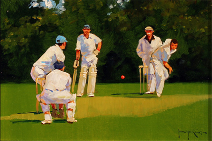
Well, the rebranding to the new ‘old’ name lasted slightly longer than England’s Ashes hopes last winter, but now the Cricketers is back to being, er, the Cricketers. With, of course, a spanking new sign – and one which proves that Greene King haven’t quite forgotten the value of a pictorial signboard:


Credit where credit is due: I think it has some charm, actually.

Now back in the good old days when craftsmen still had a place in the world, a sign painter (George Taylor, for example) would be engaged to produce something unique and distinctive for the pub. But who needs to go to all that bother now that something can just be lifted from the internet, eh? (I’m sure they got permission, right?)

Sunday, 16 March 2014

How tickled I am


A feather, you see. For tickling with. Oh, my aching sides . . .

(Actually I do quite like this one. I don't have a problem with canting per se. And given what they could have gone for instead . . .)

Tuesday, 14 January 2014

Arms and the (wrong) earl


This is another pub to ‘benefit’ from Greene King’s latest brand refresh. I have already written about the previous sign, which (correctly) displayed the arms of the Villiers family, earls of Clarendon (2nd creation).


As I noted before, this is an appropriate choice of image because 4th Earl, George Villiers, was not only a distinguished contemporary politician and diplomat, but a Cambridge man, to boot!

Come the refresh, though, it seems that these arms weren’t picturesque or fancy enough, so they went in search of something else, finding instead the arms of the Hoyles, earls of Clarendon (1st creation).

This earldom has been  extinct since 1753 (long before the pub was built) and, after the future 1st earl, Edward Hyde,  was rejected as undergraduate by Magdalen (as the spelling then was) and ended up at Magdalene in the Other Place, they have had no connection whatsoever to do with either the pub or indeed Cambridge as a whole.

And what detailed heraldic research has gone into representing this blazon? Why, search the internet and nick something, of course! (Compare the lettering on the scroll and the 'drop shadow' on the ineschutcheon and the chevrons: this is clearly a reuse of the same image. I did wonder why I could never get it to look sharp in a photograph; now I know.) St George’s Chapel, Windsor, eh? I wonder if anyone at GK read the copyright notice:
“No image or text displayed on this site may be used without the express permission of the owner. Such permission should be sought in the first instance in writing from the Dean & Canons of Windsor, via the Chapter Clerk, who will contact the owner of any photography in question.”

Thursday, 18 July 2013

A tree with a view


A reminder that those lovely people at Greene King did once know what a proper pub signboard should be like. (That is, not like this cheap-looking tat.) Unfortunately, the pub itself, and therefore even more so the signboard, is under threat, GK having put it on the market freehold. Let’s hope the locals are able to rally round and save it.

As for the sign, I have no idea whether the artist had a particular view or scene in mind, although one of the chaps sat outside the pub when I took the picture suggested that the background looked a bit like the view from Lose Hill to Mam Tor in Derbyshire. There is a certainly a slight similarity, but I’d have thought that the tree – and the boy climbing it – would be somewhat out of place in that landscape.

Thursday, 2 May 2013

What the blazes?!?!?


The Rock (Hotel), Cherry Hinton Road, Cambridge

Yet another makeover for the Rock.

This cheap-looking identikit piece of tat is, it would seem, the delightful new branding for GK’s ‘family friendly pub concept [sic], Flame Grill’. Sounds ghastly . . . A rich heritage of decorative and individual pub signboards cast aside in the interests of The Brand (and a crap one, at that).

OK, the previous signage at the Rock wasn’t much cop to start with, but the same fate is threatened for the Green Dragon, Chesterton, which would be a thoroughly unforgivable piece of cultural vandalism. Watch this space.

Uninspiring, insipid, bland, characterless . . . as a Camra colleague put it: ‘If I saw a pub sign like the one at the Rock I'd assume it was a temporary one until they got a decent one done.’

Quite.

Wednesday, 6 February 2013

Dis-arming

The Alexandra Arms, Gwydir Street, Cambridge

Reopened on 30 November 2012 after a rather fine refurbishment, including, of course, a spanking new signboard. Recently its name had been abbreviated – rather discourteously in my view – to The Alex, but now its full name has been officially restored: the Alexandra Arms. Arms.
That’s ARMS. As in ‘coat of’.
As were depicted in the previous sign, which was one of Greene King’s finer efforts.
The new sign, however, looks like this:
That’ll be a sort of portrait, then. Not a coat of arms. Nor even her actual arms. At all. This seems odd to me.
That said, I like this sign a lot, because it is unusual: I can’t think of any other pub signboards based on postage stamps except the odd one using a Penny Black for Queen Victoria. But this is even more unusual because British stamps during Alexandra’s lifetime bore only the image of the reigning Sovereign, so you wouldn’t expect to find a picture of her on a stamp at all.
Elsewhere in the Empire they were not so fastidious, and this image is taken from a 10c stamp from the Dominion of Newfoundland,[1] issued in 1911 to commemorate the coronation of her son, George V. The portrait used for the engraving seems to be derived from this photograph, the inversion and simplification presumably being introduced during the engraving process. Note the very high collar, reportedly worn to conceal a scar from a childhood injury. This, of course, became instantly fashionable – the ‘Diana haircut’ of its day.
So, it’s a good signboard, even if not heraldic. I hope the old one didn’t end up in a skip.
-----------------
[1] Specifically, judging by the tears on the perforations, this very one – yep, it’s another of those ‘found it on the Internet’ images.

Wednesday, 30 May 2012

When all this was fields (2)


I’m not sure whether this thing (is it actually impressionist, or is it just very poorly reproduced by GK's normally oh-so-thoughtful sign producers?) was chosen to represent the idyllic past of the area in which this now closed and not much missed boozer sits, but Arbury sure as hell don’t look like that anymore!

Friday, 20 April 2012

Towering achievement

There are eleven Pantons listed in Burke’s General Armory of England, Scotland, Ireland, and Wales, some differenced versions of others, but none of them an exact match for what we have here. One corresponds in some parts, however. It is given as follows:
‘Per chev. gu. and or, in chief two towers ar. in base a lion ramp az. Crest: A lion couchant, the tail between the hind legs, az. bezantée.’
So the shield would look like this:
(Image created by me using software from www.inkwellideas.com/coat_of_arms.)
Close, but some simple errors (e.g. reading the chevron as a charge rather than a division), which leads me to suspect that whoever drew up the original design for this signboard misread or misinterpreted the blazon.
And does it have anything to do with the pub? I very much doubt it. The ‘Arms’ bit of the name seems a late and aggrandising addition (cf. the Kingston Arms) for what was once the Panton Brewery tap. The brewery itself gets its name from the street on which it sits, which was in turn named after one ‘Polite’ Tommy Panton, son of Thos. Panton (chief groom or equerry to King George II). In 1806 Tommy was instrumental in getting Parliament to pass the Barnwell Enclosures Act, which allowed this area of Cambridge to be developed. (See the History of Gwydir Street for more.) But I would be very surprised if he was an armiger, and even more surprised if these were his.

Wednesday, 14 March 2012

Hurley-Burleigh/Burley

So. You’re a brewery who has just acquired a pub from pubco that needs to realise some of its assets by selling off some of its property portfolio estate. Obviously you’ll want to put your shiny new branding on it, and that includes, hopefully, an impressive signboard that represents your brand values. But what to have on it? Well, often the name of the pub itself will suggest a pretty obvious theme, and you’ve already provided a fine sign for another pub in the town only three or four years ago, so you have a pretty good idea what to do.
Now, do you go to the trouble of maybe doing a bit of research to see what’s appropriate, and then commissioning a signwriter to come up with something special? Or do you just reproduce something you find on the Internet?
Here's the new sign. Which approach do you think they took?


(Here’s a clue.)
Yep, it’s a direct lift from one of those ‘your family crest’ companies that I have commented on before (those ghastly scrolls give the game away). And as before, it is an unfortunate choice.[1]
Checking with a more authoritative source reveals that these arms (vert three boars heads couped argent armed or) belong to a Burley (note the spelling), from Leicestershire and Wiltshire. So (needless to say) it has nothing to do with the Burleigh in question here, who was a certain James Burleigh, a prominent local landowner and carrier in the late 18th century (and of course no armiger). Burleigh Street, on which the original Burleigh Arms once stood, is named after him (incidentally, its continuation, Norfolk Street, is named after his father-in-law, William Norfolk, who was mayor of Cambridge in 1769).
It wouldn’t have taken very much effort to have done this much better.
[1] I do hope, incidentally, that the proper channels were gone through and permission to reproduce was granted (for the appropriate fee) – those American copyright lawyers can get pretty nasty.
References
Ronald Grey and Derek Stubbings, Cambridge Street-names: Their origins and associations, CUP, 2000, pp. 55f.

Thursday, 23 February 2012

When all this was fields. . .

Looking at it now, it's strange to think of Chesterton as a rural idyll. Yet even by the time this pub was built, in the middle of the 19th century, the rural nature of Chesterton was beginning to turn suburban following inclosure in 1836 and the subsequent influx of ‘townies’ from Cambridge. So the name of the Haymakers, and of the Wheatsheaf which used to stand on the corner opposite, were already harking back to a ‘lost’ age.  
As well as providing a popular (albeit often ersatz) name for a pub, images of haymakers resting (or sometimes frolicking) after a long day working (or sometimes frolicking) in the fields have long been a popular theme amongst artists. The scene on this sign is based on La Charette by Louse Le Nain (1600–1648).

Tuesday, 21 February 2012

‘The moon, like to a silver bow’


The Half Moon Inn, Little St Mary’s Lane, Cambridge

The Half Moon hasn’t been a pub for many years, long before my time in Cambridge, and I didn’t even know about it until about a year ago, when I began my quest for Cambridge’s ‘dead pubs’. The sign still remains, though, a silent witness.* Yet how many times have I walked past it over the years and not noticed?
As a point of historical interest, a pub of this name, a decent three-storey establishment, originally stood on the corner of St Mary’s Lane and Trumpington Street until in 1875 it had to make way for the Emmanuel United Reform Church. Presumably the name just moved down the lane to these smaller premises, which was certainly a pub in 1885.

(*Update: This sign is actually a copy. The original, which is gilded rather than white, sits in a cabinet in the Museum of Cambridge.)


Tuesday, 24 January 2012

Twisted

Yeah, right. Ha bloody ha. I suppose someone was trying to be clever. I won’t waste more words on this.

Thursday, 5 January 2012

Mind your manors!

According to Domesday Book, before the Norman Conquest the manor of [Cherry] Hinton (in which this part of Cambridge once lay) was held by one Edeva the Fair (‘Eddeve pulcra’), who is generally assumed to be Edith Swanneck, wife more Danico of Harold II Godwinson, though the authors of Cambridge Street-names: Their origins and associations propose that it may instead be his sister, Editha, wife of Edward the Confessor. Whichever one of the two it was, after the Conquest she was replaced as lord of the manor by the rapacious Count Alan of Brittany, who did rather well out of the redistribution of land after 1066. So I suppose having a pub named after her some 1900 years later is a small consolation.

Tuesday, 20 December 2011

Badge of honour

Military medal buffs will recognise this at the 1914 Star (or ‘Mons Star’), here gilded and with added colour in true Nicholsons style. This is the campaign medal awarded to those members of the British Expeditionary Force serving in France and Belgium between 5 August and 22 November 1914.
Survivors of this phase of the war took to referring to themselves as ‘The Old Contemptibles’ after a supposed order of Wilhelm II referring to General French’s ‘contemptible little army’.
The local branch of the Old Contemptibles Association used to meet in this pub, then known as the Albion Hotel, which was renamed in their honour in 1953.

Friday, 16 December 2011

Arms and the Coronet

Lots of interesting detail in this one. We’ll start at the back, with the ‘castle’ part. The tower is Guy’s Tower, part of Warwick Castle, completed in 1395. The smaller, slit windows are original, but the larger ones at the top date from 1642, during the English Civil War, when they were widened to allow cannons to be fired from the tower. So, a small anachronism, there.
Now the ‘crown’. The headgear that this chap is sporting may look like a crown to the layman, but in fact it’s a coronet, specifically the coronet of an earl (without its cap of maintenance), which in heraldry (and here) comprises eight strawberry leaves (four visible) and eight silver balls (five visible).
This is just one clue to the identity of the fearsome-looking chap who dominates the sign. He is an earl, and probably a local one. The second, and perhaps more prominent clue, is the shield, which bears the arms of Neville (gules a saltire argent) differenced by a label of three points compony (or gobony) argent and azure. This, then, must be Richard Neville, 16th Earl of Warwick, known to history as ‘the Kingmaker’, the differencing being in honour of his Lancastrian/Beaufort descent via his paternal grandmother, Joan Beaufort. And indeed these arms appear in the 3rd quarter of Richard Neville’s full achievement.
It seems such a shame, then, that having got the heraldry more or less right, the sword and armour are hopelessly anachronistic, belonging more to the late 12th century/early 13th century than the mid-15th. In fact the sword looks remarkably similar this modern replica, with 12th-century blade style and 13th-century crossguard.

Update:
When I returned in April 2015 I found the pub converted to a hotel, and the previous decent-ish sign replaced with this rubbish one:

Monday, 28 November 2011

Mixed-up prior(it)ies

The Priory, St Neots
St Neots used to have a priory, but this isn’t it: theirs was largely pulled down after the Dissolution and no trace now remains. What adorns this sign is a heavily processed but still identifiable picture of Castle Acre Priory, Norfolk.

Monday, 14 November 2011

Trainspotting

The Engine, Baldock

Now I may be a bit of an anorak about some things (heraldry, beer, pubs spring to mind), but trains aren’t my thing at all. So for this one I had to consult my mate Pete Wiffin, landlord of the Live & Live in Cambridge. Within a split second of seeing the photograph he had identified this as LNER 1306, a Thompson Type B1 locomotive (which I suppose means something to somebody), now bearing the nameplate ‘Mayflower’.

The engine still exists, in LNER livery, as can be seen in this photo, from a similar angle, although this is a little inauthentic as it wasn’t delivered until after nationalisation, and the Mayflower was a different locomotive altogether. Also, given that it saw most of its service in and around Hull and Bradford, I doubt it ever went near Baldock in its working life, but it’s a charming little sign nonetheless. I hope it doesn’t just get lobbed into a skip should Greene King get round to ‘refurbishing’ the place.

Baldock station building itself, viewed from about the same point, now looks like this: