Showing posts with label cambridge. Show all posts

Monday, 15 June 2015

Pigs (Three Different Ones)


Flying Pig, Hills Road, Cambridge

Having been known as the Crown for most of its life (apart from one brief period when it was renamed the Engineer, presumably to attract custom from the workers at the nearby railway station), this 1830s-ish pub was renamed the Flying Pig in the late 1980s by the then proprietor – and amateur pilot – Mick the Pig.

Naturally a new name means new signage, which included this distinctive signboard.


By 2010, however, it was becoming rather weather-beaten and was in danger of becoming the ‘Fallen on Some Poor Soul’s Head Pig’, so it was removed and eventually, in April 2011, replaced by this eye-catching double-sided job, the work of Mr Penfold:


Here beer here? Hear, hear!

(Update: Well, wouldn't you just know it: as soon as I finally get round to blogging about this sign, it gets taken down because it's too heavy for the bracket. Replacement sign in due course: watch this space (or another one).)

Friday, 16 January 2015

Ringing the changes


A quick note about a couple of new bell-related signs.

First, Burwell. As is the case with most pubs with the word ‘bell’ in their name, the Five Bells stands close to the parish church, the stunning St Mary’s, which Pevsner describes as ‘[t]he most perfect example in the country of the Perp[endicular] ideal of the glasshouse’. And it did indeed have a peal of five bells from c.1709 to 1955, when three further trebles were added, so the pub is rightly named. It got a new sign over the summer.


On the left is the sign that graced the Five Bells until about August 2014. A fairly tradition motif, nicely arranged and executed. The new sign on the right, apparently designed by the current licensee, is anything but traditional, an inventive idea of nesting the bells Russian-doll style. I gather opinion in the village is mixed. I think it’s quite a clever idea, and it’s certainly eye-catching, but I can see why others might not like it much.
Back in Cambridge the Six Bells has also finally been visited by GK’s branding facelift pixies. The new sign, as of January 2015, is on the right, another traditional treatment like the old sign at Burwell, t bells arranged symmetrically and linked by a charming ribbon. Inoffensive, and it could have been a whole lot worse. But I have a soft spot for the more unusual sign it replaced, with shiny new bells sitting in he foundry. I hope it’s been kept safe.


As for the name, well, there isn’t a church, with bells or otherwise, anywhere near the place, nor was there when the pub first appeared in the 1830s, and at no time since, so this one’s a complete mystery. If anyone knows, do get in touch!

Friday, 21 November 2014

Inside only, no standing on top


Tram Depot, Dover Street, Cambridge 

Back in the late 1980s, Suffolk brewery Earl Soham took over the derelict stable block of the long-defunct Cambridge Street Tramways depot, renovated it, and turned it into a pub. What an excellent way of giving new life to neglected part of Cambridge’s heritage! (In these less enlightened times a quarter of a century later the site would probably be cleared and a monstrously insensitive and incongruous seven-storey office block would spring up in its place.) Although sadly no longer an Earl Soham house (it was taken over a few years later by Everards), the pub still has an attractive sign, appropriately featuring a horse-drawn tram, whose design has survived at least one replacement.
Tram Depot: previous sign

Tram Depot: current (2014) sign
Attractive, distinctive, eye-catching and appropriate to the building – an approach that a certain other brewer could learn from.

But. (Yes, there’s always a ‘but’.)

Is it a Cambridge tram?

Well, unfortunately, no, it isn’t. There are several clues, not least the leafy rural setting, which bears no resemblance to any part of the actual tramway. This I can put down to artistic licence and not think too much more about it, but some other inaccuracies are less easy to brush aside:
  • Cambridge Street Tramways livery was red and cream, not this sort of coffee-and-cream affair.
  • The tram car depicted here is being drawn by two horses. This was true of the competing omnibuses of the time, but aside from a brief experiment in the late 1880s, in response to widespread concerns about the welfare of the horses, all CST trams were drawn by a single horse.
  • CST tram no. 5 was a single decker.

So, a commendable effort in the true spirit of what a painted pub sign should be like, but as is so often the case, the execution is let down by an absence of research.

References
Paul Carter, Cambridge 1. The Prestige Series. Glossop: Venture Publications, 2004.
Leslie Oppitz, Tramways Remembered: East Anglia, East Midlands and Lincolnshire. Newbury: Countryside Books, 1992.
S. L. Swingle, The Cambridge Street Tramways. Locomotion Papers No. 61. Lingfield: Oakwood Press, 1972.

Monday, 14 April 2014

Allez les Rosbifs!


When I heard recently that the Baron of Beef was in line for Greene King’s latest round of fresh livery I feared the worst, especially in the light of recent dismal efforts. At the time the pub proudly displayed this sign:


Bright, eye-catching, jolly, charmingly naïve in its execution (the image, if not the glossy branding). And it depicted an actual baron of beef (sirloin still joined at the bone) being spit-roast. Pretty much a perfect example of a pub sign, in my view.

How could it be improved upon?

It has now been replaced by this.


OK, it’s not as bright, eye-catching from afar, or as charmingly naïve, but it’s actually a pretty good choice: a detail from Hogarth’s O the Roast Beef of Old England (The Calais Gate), which was painted in direct response to an unpleasant experience that the artist had at the hands of French officialdom while waiting in Calais for a boat back to England. And I’m sure we’ve all had one of those. . .

It is, then, quite pointedly anti-French, as the scrawny French cook buckles under the immense weight of a (single) sirloin of English beef, a fat friar drooling appreciatively over it while emaciated and shabby French soldiers look on enviously over their bowls of thin gruel. And dominating the background, the old mediaeval gate of Calais, built when it was still an English possession, and covered in English royal heraldry.

Hogarth and inn signs go together like chips and gravy anyway, and this is a pretty good choice of image so – and I don’t say this often, but credit where credit is due – well done, Greene King!

(Fear not, dear readers: normal service will doubtless be resumed soon.)

Related points of interest:

The picture takes its title from a popular patriotic ballad of the time.

One mid-19th-century proprietor, James Sebley, later opened an eating-house further along Bridge Street, at what is now Café Rouge, which was famous for its hams. It was said that Mr Sebley could carve so thinly that he could have covered Parker’s Piece with just a pound of the meat.

Friday, 28 March 2014

Caught!


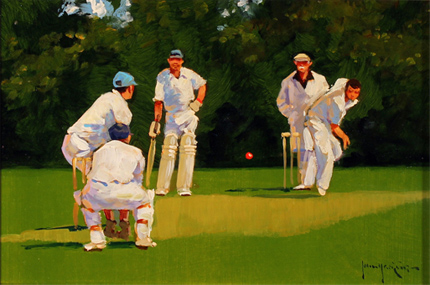
Well, the rebranding to the new ‘old’ name lasted slightly longer than England’s Ashes hopes last winter, but now the Cricketers is back to being, er, the Cricketers. With, of course, a spanking new sign – and one which proves that Greene King haven’t quite forgotten the value of a pictorial signboard:


Credit where credit is due: I think it has some charm, actually.

Now back in the good old days when craftsmen still had a place in the world, a sign painter (George Taylor, for example) would be engaged to produce something unique and distinctive for the pub. But who needs to go to all that bother now that something can just be lifted from the internet, eh? (I’m sure they got permission, right?)

Monday, 24 March 2014

Good grief, sweet prince!


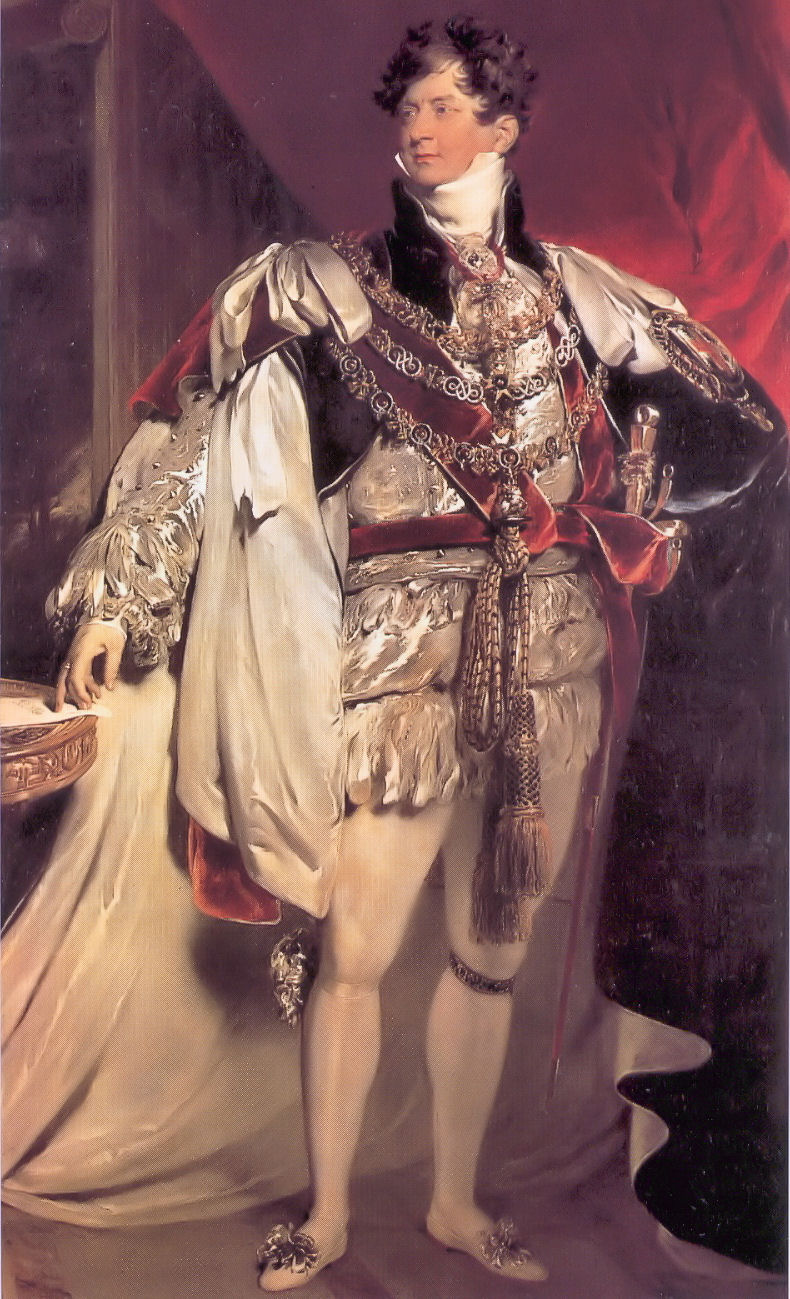
Both the pub and the street on which it sits are named in commemoration of a visit to Cambridge by George IV in November 1815, while still Prince Regent – this despite the fact that he got no closer to the centre than Barnwell, and that was only to change horses, a sidestep which the elders of the Corporation presumably didn’t take as a snub.

Like so many pubs already, it has fallen victim to the latest round of Greene King’s rather characterless (I’m being as polite as I can) rebranding operation. Up until 21 March 2014 it bore this sign.


Based on the coronation portrait by Sir Thomas Lawrence (by which time he was, of course, King George IV, no longer Prince Regent, but we’ll overlook that small detail), it was colourful, easily identifiable from a distance, and eye-catching, like any good pub sign should be.

It’s now been replaced by this . . . creation, which is none of those things:


More suitable for a trendy wine bar than a pub, I’d say. Which might actually be more to Georgy-Porgy’s taste, come to think of it.

Tuesday, 14 January 2014

Arms and the (wrong) earl


This is another pub to ‘benefit’ from Greene King’s latest brand refresh. I have already written about the previous sign, which (correctly) displayed the arms of the Villiers family, earls of Clarendon (2nd creation).


As I noted before, this is an appropriate choice of image because 4th Earl, George Villiers, was not only a distinguished contemporary politician and diplomat, but a Cambridge man, to boot!

Come the refresh, though, it seems that these arms weren’t picturesque or fancy enough, so they went in search of something else, finding instead the arms of the Hoyles, earls of Clarendon (1st creation).

This earldom has been  extinct since 1753 (long before the pub was built) and, after the future 1st earl, Edward Hyde,  was rejected as undergraduate by Magdalen (as the spelling then was) and ended up at Magdalene in the Other Place, they have had no connection whatsoever to do with either the pub or indeed Cambridge as a whole.

And what detailed heraldic research has gone into representing this blazon? Why, search the internet and nick something, of course! (Compare the lettering on the scroll and the 'drop shadow' on the ineschutcheon and the chevrons: this is clearly a reuse of the same image. I did wonder why I could never get it to look sharp in a photograph; now I know.) St George’s Chapel, Windsor, eh? I wonder if anyone at GK read the copyright notice:
“No image or text displayed on this site may be used without the express permission of the owner. Such permission should be sought in the first instance in writing from the Dean & Canons of Windsor, via the Chapter Clerk, who will contact the owner of any photography in question.”

Wednesday, 6 February 2013

Dis-arming

The Alexandra Arms, Gwydir Street, Cambridge

Reopened on 30 November 2012 after a rather fine refurbishment, including, of course, a spanking new signboard. Recently its name had been abbreviated – rather discourteously in my view – to The Alex, but now its full name has been officially restored: the Alexandra Arms. Arms.
That’s ARMS. As in ‘coat of’.
As were depicted in the previous sign, which was one of Greene King’s finer efforts.
The new sign, however, looks like this:
That’ll be a sort of portrait, then. Not a coat of arms. Nor even her actual arms. At all. This seems odd to me.
That said, I like this sign a lot, because it is unusual: I can’t think of any other pub signboards based on postage stamps except the odd one using a Penny Black for Queen Victoria. But this is even more unusual because British stamps during Alexandra’s lifetime bore only the image of the reigning Sovereign, so you wouldn’t expect to find a picture of her on a stamp at all.
Elsewhere in the Empire they were not so fastidious, and this image is taken from a 10c stamp from the Dominion of Newfoundland,[1] issued in 1911 to commemorate the coronation of her son, George V. The portrait used for the engraving seems to be derived from this photograph, the inversion and simplification presumably being introduced during the engraving process. Note the very high collar, reportedly worn to conceal a scar from a childhood injury. This, of course, became instantly fashionable – the ‘Diana haircut’ of its day.
So, it’s a good signboard, even if not heraldic. I hope the old one didn’t end up in a skip.
-----------------
[1] Specifically, judging by the tears on the perforations, this very one – yep, it’s another of those ‘found it on the Internet’ images.

Wednesday, 14 March 2012

Hurley-Burleigh/Burley

So. You’re a brewery who has just acquired a pub from pubco that needs to realise some of its assets by selling off some of its property portfolio estate. Obviously you’ll want to put your shiny new branding on it, and that includes, hopefully, an impressive signboard that represents your brand values. But what to have on it? Well, often the name of the pub itself will suggest a pretty obvious theme, and you’ve already provided a fine sign for another pub in the town only three or four years ago, so you have a pretty good idea what to do.
Now, do you go to the trouble of maybe doing a bit of research to see what’s appropriate, and then commissioning a signwriter to come up with something special? Or do you just reproduce something you find on the Internet?
Here's the new sign. Which approach do you think they took?


(Here’s a clue.)
Yep, it’s a direct lift from one of those ‘your family crest’ companies that I have commented on before (those ghastly scrolls give the game away). And as before, it is an unfortunate choice.[1]
Checking with a more authoritative source reveals that these arms (vert three boars heads couped argent armed or) belong to a Burley (note the spelling), from Leicestershire and Wiltshire. So (needless to say) it has nothing to do with the Burleigh in question here, who was a certain James Burleigh, a prominent local landowner and carrier in the late 18th century (and of course no armiger). Burleigh Street, on which the original Burleigh Arms once stood, is named after him (incidentally, its continuation, Norfolk Street, is named after his father-in-law, William Norfolk, who was mayor of Cambridge in 1769).
It wouldn’t have taken very much effort to have done this much better.
[1] I do hope, incidentally, that the proper channels were gone through and permission to reproduce was granted (for the appropriate fee) – those American copyright lawyers can get pretty nasty.
References
Ronald Grey and Derek Stubbings, Cambridge Street-names: Their origins and associations, CUP, 2000, pp. 55f.

Tuesday, 24 January 2012

Twisted

Yeah, right. Ha bloody ha. I suppose someone was trying to be clever. I won’t waste more words on this.

Thursday, 5 January 2012

Mind your manors!

According to Domesday Book, before the Norman Conquest the manor of [Cherry] Hinton (in which this part of Cambridge once lay) was held by one Edeva the Fair (‘Eddeve pulcra’), who is generally assumed to be Edith Swanneck, wife more Danico of Harold II Godwinson, though the authors of Cambridge Street-names: Their origins and associations propose that it may instead be his sister, Editha, wife of Edward the Confessor. Whichever one of the two it was, after the Conquest she was replaced as lord of the manor by the rapacious Count Alan of Brittany, who did rather well out of the redistribution of land after 1066. So I suppose having a pub named after her some 1900 years later is a small consolation.

Friday, 12 August 2011

Oops Acropolis!

The Bath House (formerly The Bath Hotel) sits in a Grade II listed 17th-century building, with reworked 18th-century frontage. So when Greene King decided to replace the former generic signboard, it must have seemed so obvious to go for something classical – this is Cambridge, after all. Perhaps a Roman bath, then?
Not a bit of it. What we actually have is this:
It’s a detail from the south-east corner of the temple of Athena Nike on the Athenian Acropolis. Not a bath-house, not Roman, and nothing to do with the building or Cambridge whatsoever.
If (polite) words failed me about the Hippodrome, March, I am left completely speechless by this idiocy.

Monday, 4 July 2011

County doesn't seem to matter after all

An update to the very first post on this blog, about the sign that started it all off. Because there is a new one:
I’m not very impressed with it. First, gone is the old Arms of the old county on the bracket, to be replaced by some rather clunky Everards branding. Admittedly it was looking more than a little weather-beaten, but I know which of the two I would rather have on there.
Then there’s the picture itself:
This looks like a fairly faithful reproduction of what was there before, except that the colours have changed, and become more intense. This means that what should be yellow (Or) is now more of a Dale Winton orange, which is not an heraldic tincture. And the crossed keys around the neck of the dexter supporter should be silver (Argent) and gold (Or), although that was wrong in the previous sign as well.

Small details, perhaps. But would Everards be so cavalier if it were the Arms of Leicestershire CC rather than Cambridgeshire?

Tuesday, 7 June 2011

What the Fawkes?!

The ‘King’s Head Tavern’, Midsummer Common, Cambridge
OK, this isn’t a ‘real’ pub sign, belonging instead to one of the bars at this year’s Strawberry Fair. But even so, what the hell is it meant to be? Charles I wearing a V for Vendetta-style Guy Fawkes mask? Is someone trying to be clever? Tavern, indeed. . . It's a marquee!
I went to the real ale bar instead. And ended up drinking Pickled Pig cider because there was no dark beer on offer and I can't bear all that hoppy, citrus-y Oakham stuff that seems to be all the rage at the moment.

Update: The King's Head, Yarmouth, IoW has a very similar sign, only without the Fawkes/V for Vendetta nonsense.

Thursday, 19 May 2011

Berks’ heraldry

I’m sure most people have encountered those business that peddle items emblazoned with ‘your family coat of arms’, determined purely by surname, not by any genealogical research. With the Court of Chivalry no longer sitting, this can be regarded as a harmless bit of fun, appealing to the gullible and the heraldically ignorant (online ones particularly aimed at the American market, it seems, about which I make no further comment) – but on no account should they or their dubious claims be taken seriously.
The Kingston Arms currently has this on its signboard.
When I first saw it, I was puzzled. ‘What has the Duchy of Brabant to do with this pub?’ I wondered. But a little searching reveals that it’s nothing to do with the Low Countries at all: a number of these ‘family heraldry’ companies offer this as the coat of arms belonging to the surname Kingston. No pedigree, no genealogy, just the shield: sable a lion rampant or.
But does it have anything to do with the pub?
Of course not! It took a little intelligent digging (more than went into the selection of this device for the pub, obviously), but I finally found out that the Kingston family entitled to bear these arms were lords of one of the manors of Kingston Bagpuize in far-away Berkshire (Oxfordshire since 1974). The line became extinct in 1515 and the manor was sold out of the family in 1545. Well, at least there’s no one alive to challenge the appropriation of their arms.
The Kingston from whom the street and the pub take their respective names was in fact one Thomas Kingston, known locally as ‘Miser’ Kingston, who owned houses in nearby Sleaford Street. He wore shabby clothes, had a long beard, and frightened children, apparently. He also had a reputation for watering the farm workers’ beer, which is not really the sort of reputation that a self-respecting pub would want to associate itself with, but there you go.
He was not, however, an armiger, so the very name of the pub is a bit fake to start with, a fakery which the present sign compounds.
References
Gray, R., and D. Stubbings, Cambridge Street-names: Their origins and associations. CUP 2000

Wednesday, 18 May 2011

Couldn’t give it away


According to the pub’s web site, ‘The pub got its name from when part of it was a printing press which circulated a free Cambridge newspaper. Unfortunately for them it lasted one issue, but the name survived.’
Exactly when this was it doesn’t say, but there has been a pub on this site, apparently of that name, since at least 1851 (Gardner’s Directory).

Unknown soldier

The first building to go up on what is now Russell Court/Russell Street, in 1835, was a brewery – they had their priorities right in them days! Whatever it had been called before, by 1859 it had been named after the Battle of the Alma (September 20, 1854), which is often considered the first battle of the Crimean War (1853–1856). A new brewery was built behind a few years later, and the old brewery building became the brewery tap (which had been licensed as a beerhouse since at least 1860).[1]
The present sign depicts a British soldier, stood beneath a Red Ensign (which is primarily a non-military naval flag, so I’ve no idea what it’s meant to be doing here), smoking a pipe and surveying the field after the battle. But is it any old soldier?
Well, although not depicted in ay great detail, he does seem to be wearing the uniform of the Royal Welch Fusiliers as it was at the time of the battle. One of their number, Colour Sergeant Luke O’Connor, although himself wounded, continued to carry the Queen’s Colour throughout the battle. For this, and for other actions during the war, he was later awarded the Victoria Cross, the first soldier to receive this honour. So perhaps this is him, the red ensign is standing in for the Queen’s Colour, being rather easier to paint.[2] Sgt O’Connor has no connection with Cambridge, though. But the commander of the 1st Division (Guards and Highland brigades) at the battle was Prince George, the then 2nd Duke of Cambridge (fourth creation, 1801).
If there is an original painting on which sign is based, and if I ever manage to track it down, that may clear up a few things.
References
[1] Flood, B., Cambridge Breweries, Cambridge Society for Industrial Archaeology and CAMRA, 1987.
[2] See this photograph of a modern reenactment group, including the Queen’s Colour.

Tuesday, 10 May 2011

The crux of the matter

The Clarendon Arms, Clarendon Street, Cambridge 
These are the arms of the Villiers family, Baronets since 1619, and from 1776 Earls of Clarendon (2nd creation):
ARMS: Argent on a cross Gules five escallops Or.
CREST: A lion rampant Argent ducally crowned Or.
SUPPORTERS: Two eagles wings endorsed Sable, ducally crowned Or, charged on the breast with a plain cross Or.
MOTTO: Fidei Coticula Crux (The Cross is the touchstone of Faith).
The eagles look more like angry blackbirds to me, but otherwise that’s a pretty accurate representation.
The pub, like the street it’s on, is named in honour of the 4th Earl, George Villiers, a distinguished politician and diplomat – and a Cambridge man, to boot!


Source
Gray, R., and D. Stubbings, Cambridge Street-names: Their origins and associations. Cambridge, CUP 2000


Any Port(land) in a storm

These are the arms of the Cavendish-Bentinck family, dukes of Portland. The blazon is given by Nottinghamshire History as follows (with some tweaks by me) : 
ARMS: Quarterly 1st and 4th, azure, a cross moline argent, for BENTINCK; 2nd and 3rd, sable*, three stags' heads caboshed argent, attired or**, a crescent for difference***, for CAVENDISH.
CRESTS: 1. Out of ducal coronet gold, two arms counter-embowed, vested gules, on the hands gloves or, each holding an ostrich feather argent****, for BENTINCK. 2. On a wreath argent and sable, a snake nowed proper*****, for CAVENDISH.
SUPPORTERS: Two lions double queued, the dexter or the sinister sable.
MOTTO: Craignez honte (Fear shame)
* Purpure in this representation, for some reason.
** Not here.
*** Missing in this version.
**** Looks more like a Morris dancer’s handkerchief to me
***** Here argent. Doesn't look much like a snake, either, so maybe the artist didn't quite know what it was meant to be.
The present neo-Georgian building, designed by Basil Oliver, dates from the 1930s, although there has been a pub of that name on this site since at least 1852. That would correspond with the 4th Duke of Portland:, though why he should be honoured with a pub in Cambridge is anyone’s guess. It may be older, and go back to the 3rd Duke , who enjoyed an illustrious political career and is a more likely candidate.

Tuesday, 3 May 2011

Any fort in a storm

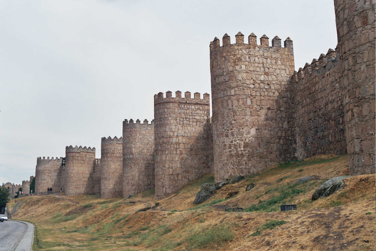
The Fort had a substantial renovation in 2008, which of course included a new sign. You’d think they might have gone for a picture of the Fort St George (in India), from which the place derives its name, wouldn’t you? But no, that would be too obvious (or require too much research). Instead we are treated to this rather dull image of some curtain walls with a generous sprinkling of mural towers:
Now maybe it’s because of all those Westerns I used to watch as a kid, but that’s not the image my mind conjures up when I hear the word ‘fort’: these are clearly defensive walls of a city or a substantial castle. At first I used to think that it wasn’t based on anything in the real world (and did rather wonder what the sign-painter had been drinking), but then I found a photograph of the walls of Ávila looked strikingly familiar. That’ll be the Ávila in Castilla y Leon, then. In Spain. Not England. Not India. Spain. And so far as I know, it has no connection with St George, either.
Well done, Greene King!
For the record, the sign it replaced looked like this:
The arms and supporters are clearly fanciful (forts cannot be armigerous entities), and the motto is that of a family by the name of St George (who appear to be Irish, so far as I can discover), presumably found in a book or on the internet. It was quite nice, though.