Sunday, 13 March 2016

Ship shape

One would guess that the pub is named after HMS Royal Albert, which was launched from Woolwich Dockyard in 1854 – the same year that the Crystal Palace was relocated from Hyde Park to nearby Sydenham Hill. Associations with the Prince Consort were doubtless a good thing in the area at the time.


This particular sign takes as its visual inspiration* an engraving by J.W. Carmichael called Homeward Bound, which appeared in the London Illustrated News in 1857. It’s a nice illustration, but it can’t be the ship in question because it appears to have only two gun decks, whereas the Royal Albert had three. This, it would seem, was known to the anonymous sign painter, who accordingly introduced a third gun deck into his picture. If only all signs could be researched so thoroughly…

* Note: not merely copied/nicked – and yes Greene King, I’m looking at you.

Tuesday, 8 March 2016

Stand in the corner!


Despite its name – and the impression that might have been given by its previous signboard (see below) – this has always been a pub and has no association with the once-famous Lyons Corner Houses of London. It is so named simply because it is on a street corner. The present building stands on the site of a pub called the Butchers Arms, dating from around 1869, which was rebuilt and renamed sometime in the 1920s.

Although completely unrelated (close inspection reveals that it’s not even a corner house, just a Lyons tea shop), the image on the previous sign had some charm.


Then in late 2014 it fell foul of Greene King’s widespread ‘brand refresh’ and was replaced with this:


It didn’t take my Camra colleagues long to find the source: Gill’s Corner House, Dublin 356, by Irish artist Chris Mc Morrow. Yes, another ‘lifted from the Internet’ special from Bury St Edmund’s finest. Now it’s not unknown for pubs to have a picture of themselves on the signboard – but to have a picture of a completely different pub in a different country is a little odd, I’d say. Maybe they were hoping no one would recognise it. Ha!

Anyway. Note how the Guinness branding in the original has been blacked out in the sign: well, we can’t be seen to acknowledge the existence of any other breweries, can we, Greene King?

I’m sure all the appropriate formalities surrounding boring stuff like permission and copyright and fees and consent for the marring of original artwork were meticulously observed...

Monday, 15 June 2015

Pigs (Three Different Ones)


Flying Pig, Hills Road, Cambridge

Having been known as the Crown for most of its life (apart from one brief period when it was renamed the Engineer, presumably to attract custom from the workers at the nearby railway station), this 1830s-ish pub was renamed the Flying Pig in the late 1980s by the then proprietor – and amateur pilot – Mick the Pig.

Naturally a new name means new signage, which included this distinctive signboard.


By 2010, however, it was becoming rather weather-beaten and was in danger of becoming the ‘Fallen on Some Poor Soul’s Head Pig’, so it was removed and eventually, in April 2011, replaced by this eye-catching double-sided job, the work of Mr Penfold:


Here beer here? Hear, hear!

(Update: Well, wouldn't you just know it: as soon as I finally get round to blogging about this sign, it gets taken down because it's too heavy for the bracket. Replacement sign in due course: watch this space (or another one).)

Wednesday, 6 May 2015

Hey-diddle-diddle


This smallest estate pub on a rather sprawling mid-20th-century estate was probably just about my local when I was growing up. I can say without shame, though, that I’ve never been in, and as it remains real-ale-free, I can’t see myself doing so any time soon either.

The sign, though, I like: it has a certain Tenniel-like quality and charm, though so far as I’ve been able to discover it’s not by the man himself, but an anonymous piece of clipart.

As for the origin of the name, well, everything so far proposed strikes me as fanciful, claw-clutching nonsense so I won’t be acknowledging any of them even in passing.

Friday, 16 January 2015

Ringing the changes


A quick note about a couple of new bell-related signs.

First, Burwell. As is the case with most pubs with the word ‘bell’ in their name, the Five Bells stands close to the parish church, the stunning St Mary’s, which Pevsner describes as ‘[t]he most perfect example in the country of the Perp[endicular] ideal of the glasshouse’. And it did indeed have a peal of five bells from c.1709 to 1955, when three further trebles were added, so the pub is rightly named. It got a new sign over the summer.


On the left is the sign that graced the Five Bells until about August 2014. A fairly tradition motif, nicely arranged and executed. The new sign on the right, apparently designed by the current licensee, is anything but traditional, an inventive idea of nesting the bells Russian-doll style. I gather opinion in the village is mixed. I think it’s quite a clever idea, and it’s certainly eye-catching, but I can see why others might not like it much.
Back in Cambridge the Six Bells has also finally been visited by GK’s branding facelift pixies. The new sign, as of January 2015, is on the right, another traditional treatment like the old sign at Burwell, t bells arranged symmetrically and linked by a charming ribbon. Inoffensive, and it could have been a whole lot worse. But I have a soft spot for the more unusual sign it replaced, with shiny new bells sitting in he foundry. I hope it’s been kept safe.


As for the name, well, there isn’t a church, with bells or otherwise, anywhere near the place, nor was there when the pub first appeared in the 1830s, and at no time since, so this one’s a complete mystery. If anyone knows, do get in touch!

Friday, 21 November 2014

Inside only, no standing on top


Tram Depot, Dover Street, Cambridge 

Back in the late 1980s, Suffolk brewery Earl Soham took over the derelict stable block of the long-defunct Cambridge Street Tramways depot, renovated it, and turned it into a pub. What an excellent way of giving new life to neglected part of Cambridge’s heritage! (In these less enlightened times a quarter of a century later the site would probably be cleared and a monstrously insensitive and incongruous seven-storey office block would spring up in its place.) Although sadly no longer an Earl Soham house (it was taken over a few years later by Everards), the pub still has an attractive sign, appropriately featuring a horse-drawn tram, whose design has survived at least one replacement.
Tram Depot: previous sign

Tram Depot: current (2014) sign
Attractive, distinctive, eye-catching and appropriate to the building – an approach that a certain other brewer could learn from.

But. (Yes, there’s always a ‘but’.)

Is it a Cambridge tram?

Well, unfortunately, no, it isn’t. There are several clues, not least the leafy rural setting, which bears no resemblance to any part of the actual tramway. This I can put down to artistic licence and not think too much more about it, but some other inaccuracies are less easy to brush aside:
  • Cambridge Street Tramways livery was red and cream, not this sort of coffee-and-cream affair.
  • The tram car depicted here is being drawn by two horses. This was true of the competing omnibuses of the time, but aside from a brief experiment in the late 1880s, in response to widespread concerns about the welfare of the horses, all CST trams were drawn by a single horse.
  • CST tram no. 5 was a single decker.

So, a commendable effort in the true spirit of what a painted pub sign should be like, but as is so often the case, the execution is let down by an absence of research.

References
Paul Carter, Cambridge 1. The Prestige Series. Glossop: Venture Publications, 2004.
Leslie Oppitz, Tramways Remembered: East Anglia, East Midlands and Lincolnshire. Newbury: Countryside Books, 1992.
S. L. Swingle, The Cambridge Street Tramways. Locomotion Papers No. 61. Lingfield: Oakwood Press, 1972.

Monday, 5 May 2014

Positive or negative?


Dalham Hall, which overlooks the picturesque little Suffolk village of Dalham, was for many years the home of the Afflecks, raised to the baronetcy (and therefore entitled to arms) in 1782. The family appears to have originated in Scotland, and the line, as well as the baronetcy, seems to have died out in the 1930s, in ignominy and in Australia.

According to the village’s website, the Elizabethan pub, which was one of the first buildings in the vilage to be erected (they had their priorities right in those days!), was named in honour of Lieutenant General Sir James Affleck (1759–1833), 3rd baronet, who was Colonel of the 16th Dragoons. (It’s an excellent pub, well worth an excursion.)

So, unlike some pubs I have mentioned previously, and others besides, here we have a pub named after the correct armigerous family. Full marks so far. The sign is a nice heraldic one, too.


But, is it correct? Well, the style – the double scroll especially – makes me think of one of those dreadfully misleading ‘your family crest’ sites, but I can’t find anything online that it could have been taken from. So hopes are high.

From various sources[1], we can write the complete blazon for the Dalham Afflecks as follows: 

Arms: Argent three bars sable
Crest: An ear of wheat proper
Motto: Pretiosum Quod Utile

This means that the shield should be white with three black stripes. This is what we see in the funeral monument of John Affleck (d. 1718), the first of the Dalham Afflecks, impaled with (presumably) the arms of his wife, Neeltje (née Schape, of Amsterdam).
Have another look at the sign:


Count the lines. Oops! That’s black with three white stripes (sable, three bars argent) – the negative, those of a photographic bent might think, of what it should be. Perhaps the artist was given as a brief, not the clear and specific heraldic description, but the ambiguous instruction ‘seven horizontal black and white stripes’. Explicable, but still very disappointing and easily avoidable.

The same generosity cannot be extended to the crest, however.


Looks nothing like a heraldic ear of corn. (And while I’m at it, the mantling and torse ought to be the same colours as the shield, i.e. black and white, not red and white.)


The motto is at least correct – although English heraldry prefers it to be placed below, not above, and of course giving the name as well is superfluous.


So, it’s a perfectly attractive and detailed sign, no careless daub, but let down by a couple of easily avoided errors. My hopes were high, but I ended up more disappointed than delighted.


Note


Ar. three bars sa.

Crest: an ear of rye ppr.

Encyclopaedia Heraldica gives only the crest, “an ear (or fleck) of rye ppr”.

The Heraldry Institute’s site give the arms (in French), and provides the motto as:

“D'argent à trois fasces de sable Cimier un épi de froment au naturel Devise PRETIOSUM QUOD UTILE”

Monday, 14 April 2014

Allez les Rosbifs!


When I heard recently that the Baron of Beef was in line for Greene King’s latest round of fresh livery I feared the worst, especially in the light of recent dismal efforts. At the time the pub proudly displayed this sign:


Bright, eye-catching, jolly, charmingly naïve in its execution (the image, if not the glossy branding). And it depicted an actual baron of beef (sirloin still joined at the bone) being spit-roast. Pretty much a perfect example of a pub sign, in my view.

How could it be improved upon?

It has now been replaced by this.


OK, it’s not as bright, eye-catching from afar, or as charmingly naïve, but it’s actually a pretty good choice: a detail from Hogarth’s O the Roast Beef of Old England (The Calais Gate), which was painted in direct response to an unpleasant experience that the artist had at the hands of French officialdom while waiting in Calais for a boat back to England. And I’m sure we’ve all had one of those. . .

It is, then, quite pointedly anti-French, as the scrawny French cook buckles under the immense weight of a (single) sirloin of English beef, a fat friar drooling appreciatively over it while emaciated and shabby French soldiers look on enviously over their bowls of thin gruel. And dominating the background, the old mediaeval gate of Calais, built when it was still an English possession, and covered in English royal heraldry.

Hogarth and inn signs go together like chips and gravy anyway, and this is a pretty good choice of image so – and I don’t say this often, but credit where credit is due – well done, Greene King!

(Fear not, dear readers: normal service will doubtless be resumed soon.)

Related points of interest:

The picture takes its title from a popular patriotic ballad of the time.

One mid-19th-century proprietor, James Sebley, later opened an eating-house further along Bridge Street, at what is now Café Rouge, which was famous for its hams. It was said that Mr Sebley could carve so thinly that he could have covered Parker’s Piece with just a pound of the meat.

Friday, 28 March 2014

Caught!


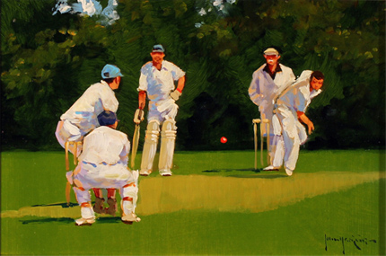
Well, the rebranding to the new ‘old’ name lasted slightly longer than England’s Ashes hopes last winter, but now the Cricketers is back to being, er, the Cricketers. With, of course, a spanking new sign – and one which proves that Greene King haven’t quite forgotten the value of a pictorial signboard:


Credit where credit is due: I think it has some charm, actually.

Now back in the good old days when craftsmen still had a place in the world, a sign painter (George Taylor, for example) would be engaged to produce something unique and distinctive for the pub. But who needs to go to all that bother now that something can just be lifted from the internet, eh? (I’m sure they got permission, right?)

Monday, 24 March 2014

Good grief, sweet prince!


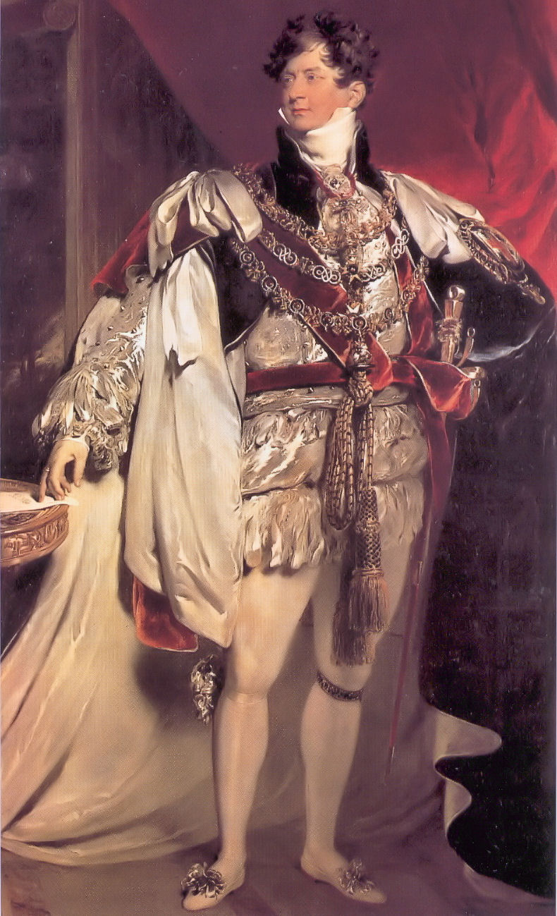
Both the pub and the street on which it sits are named in commemoration of a visit to Cambridge by George IV in November 1815, while still Prince Regent – this despite the fact that he got no closer to the centre than Barnwell, and that was only to change horses, a sidestep which the elders of the Corporation presumably didn’t take as a snub.

Like so many pubs already, it has fallen victim to the latest round of Greene King’s rather characterless (I’m being as polite as I can) rebranding operation. Up until 21 March 2014 it bore this sign.


Based on the coronation portrait by Sir Thomas Lawrence (by which time he was, of course, King George IV, no longer Prince Regent, but we’ll overlook that small detail), it was colourful, easily identifiable from a distance, and eye-catching, like any good pub sign should be.

It’s now been replaced by this . . . creation, which is none of those things:


More suitable for a trendy wine bar than a pub, I’d say. Which might actually be more to Georgy-Porgy’s taste, come to think of it.

Sunday, 16 March 2014

How tickled I am


A feather, you see. For tickling with. Oh, my aching sides . . .

(Actually I do quite like this one. I don't have a problem with canting per se. And given what they could have gone for instead . . .)

Tuesday, 14 January 2014

Arms and the (wrong) earl


This is another pub to ‘benefit’ from Greene King’s latest brand refresh. I have already written about the previous sign, which (correctly) displayed the arms of the Villiers family, earls of Clarendon (2nd creation).


As I noted before, this is an appropriate choice of image because 4th Earl, George Villiers, was not only a distinguished contemporary politician and diplomat, but a Cambridge man, to boot!

Come the refresh, though, it seems that these arms weren’t picturesque or fancy enough, so they went in search of something else, finding instead the arms of the Hoyles, earls of Clarendon (1st creation).

This earldom has been  extinct since 1753 (long before the pub was built) and, after the future 1st earl, Edward Hyde,  was rejected as undergraduate by Magdalen (as the spelling then was) and ended up at Magdalene in the Other Place, they have had no connection whatsoever to do with either the pub or indeed Cambridge as a whole.

And what detailed heraldic research has gone into representing this blazon? Why, search the internet and nick something, of course! (Compare the lettering on the scroll and the 'drop shadow' on the ineschutcheon and the chevrons: this is clearly a reuse of the same image. I did wonder why I could never get it to look sharp in a photograph; now I know.) St George’s Chapel, Windsor, eh? I wonder if anyone at GK read the copyright notice:
“No image or text displayed on this site may be used without the express permission of the owner. Such permission should be sought in the first instance in writing from the Dean & Canons of Windsor, via the Chapter Clerk, who will contact the owner of any photography in question.”

Monday, 13 January 2014

Arms and the Duke


The Duke of Wellington, Willingham

As the cold wind of a rather tacky and plasticky branding refresh sweeps through the Greene King estate, the Duke of Wellington gets a spanking new sign. Even though it’s not called the Wellington Arms, they’ve gone for a nice heraldic job, being the arms of the eponymous Arthur Wellesley, 1st Duke of Wellington:

It’s very full and detailed. And also looks pretty much identical to the image on Wikipedia, even down to the shading. I do hope no copyright has been breached. . .

Burke’s Armory[1] gives the blazon thus

Arms: Quarterly, 1st and 4th gules. a cross argent between five plates in saltire in each quarter, for Wellesley; 2nd and 3rd, or, a lion rampant gules [armed and langued azure][2], for Colley; and as an honourable, in chief an inescutcheon charged with the crosses of St George, St Andrew, and St Patrick conjoined, being the union badge of the United Kingdom of Great Britain and Ireland.
Crest: Out of a ducal coronet or, a demi-lion rampant gules holding a forked pennon flowing to the sinister also gules one-third per pale from the staff argent charged with the cross of St George.
Supporters: Two lions gules eacge gorged with an Eastern crown and chained or.
Motto: Virtutis Fortuna Comes

The inescutcheon was awarded as an augmentation in honour of Wellington’s military successes, especially his famous victory at Waterloo.[3]

Previously the sign bore this rather nice image of the man himself, based on an 1818 portrait by Sir Thomas Laurence (albeit with a different colour background and reversed, for some reason best known to the signpainter).


To my mind it seems a bit odd to use a depiction of the arms on a sign if the pub isn’t itself called the So-and-so Arms, but it could have been so very much worse.

Refs:
[1] Burke, Sir Bernard, 1884, The General Armory of England, Ireland Scotland and Wales, p. 1089.
[2] Added, for completeness’ sake, from Brooke-Little, J.P., 1978. Boutell's Heraldry.

[3] Fox-Davies, A.C., 2007. A Complete Guide to Heraldry, p. 594.

Thursday, 18 July 2013

A tree with a view


A reminder that those lovely people at Greene King did once know what a proper pub signboard should be like. (That is, not like this cheap-looking tat.) Unfortunately, the pub itself, and therefore even more so the signboard, is under threat, GK having put it on the market freehold. Let’s hope the locals are able to rally round and save it.

As for the sign, I have no idea whether the artist had a particular view or scene in mind, although one of the chaps sat outside the pub when I took the picture suggested that the background looked a bit like the view from Lose Hill to Mam Tor in Derbyshire. There is a certainly a slight similarity, but I’d have thought that the tree – and the boy climbing it – would be somewhat out of place in that landscape.

Thursday, 2 May 2013

What the blazes?!?!?


The Rock (Hotel), Cherry Hinton Road, Cambridge

Yet another makeover for the Rock.

This cheap-looking identikit piece of tat is, it would seem, the delightful new branding for GK’s ‘family friendly pub concept [sic], Flame Grill’. Sounds ghastly . . . A rich heritage of decorative and individual pub signboards cast aside in the interests of The Brand (and a crap one, at that).

OK, the previous signage at the Rock wasn’t much cop to start with, but the same fate is threatened for the Green Dragon, Chesterton, which would be a thoroughly unforgivable piece of cultural vandalism. Watch this space.

Uninspiring, insipid, bland, characterless . . . as a Camra colleague put it: ‘If I saw a pub sign like the one at the Rock I'd assume it was a temporary one until they got a decent one done.’

Quite.

Wednesday, 6 February 2013

Dis-arming

The Alexandra Arms, Gwydir Street, Cambridge

Reopened on 30 November 2012 after a rather fine refurbishment, including, of course, a spanking new signboard. Recently its name had been abbreviated – rather discourteously in my view – to The Alex, but now its full name has been officially restored: the Alexandra Arms. Arms.
That’s ARMS. As in ‘coat of’.
As were depicted in the previous sign, which was one of Greene King’s finer efforts.
The new sign, however, looks like this:
That’ll be a sort of portrait, then. Not a coat of arms. Nor even her actual arms. At all. This seems odd to me.
That said, I like this sign a lot, because it is unusual: I can’t think of any other pub signboards based on postage stamps except the odd one using a Penny Black for Queen Victoria. But this is even more unusual because British stamps during Alexandra’s lifetime bore only the image of the reigning Sovereign, so you wouldn’t expect to find a picture of her on a stamp at all.
Elsewhere in the Empire they were not so fastidious, and this image is taken from a 10c stamp from the Dominion of Newfoundland,[1] issued in 1911 to commemorate the coronation of her son, George V. The portrait used for the engraving seems to be derived from this photograph, the inversion and simplification presumably being introduced during the engraving process. Note the very high collar, reportedly worn to conceal a scar from a childhood injury. This, of course, became instantly fashionable – the ‘Diana haircut’ of its day.
So, it’s a good signboard, even if not heraldic. I hope the old one didn’t end up in a skip.
-----------------
[1] Specifically, judging by the tears on the perforations, this very one – yep, it’s another of those ‘found it on the Internet’ images.

Friday, 24 August 2012

One for sorrow . . .

Not only does this fine back-street local have the best-kept beer in Cambridge (in my not at all humble opinion), it also has a most interesting two-sided signboard:

Live & Let Live, north-facing side of signboard


Live & Let Live, south-facing side of signboard


The signature and date reveal that it was painted in 1987 by one G. Jones, and is a copy of the last known sign of a pub called The Man Loaded With Mischief, which once stood on Madingley Road. The original sign, painted by local artist and prolific inn sign painter Richard Hopkins Leach, now resides in the Museum of Cambridge (formerly the White Horse Inn) on Castle Street.


(Unfortunately it's presently fixed flat against the wall so there is no way of telling whther this also had a different design on the reverse.)
But what strange thing is depicted? Well, the theme is an old one, of a miserable-looking man laden with a magpie (harbinger of misfortune), a monkey (think of the phrase ‘a monkey on your back’) and a gin-swilling wife. The most frequently cited source is a sign believed to have been painted for an inn of that name on Oxford Street, London, possibly by Hogarth:
This is clearly very closely related to a wonderful print published by Robert Sayer in 1766, entitled A Man Loaded with Mischief, Or Matrimony: A Monkey, a Magpie, and Wife; is the True Emblem of Strife. ‘Drawn by Experience; engraved by Design.’ The Library of Congress describes it thus:
“Print shows a man chained to wedlock carrying a woman on his back, her breasts exposed, she holds a cup labeled ‘gin’ and toasts ‘My Bucks Health’, and according to a pig in a pen, ‘She is as Drunk as David's Sow’; a monkey sits on the woman's lap, removing the man's wig, and a magpie sits on the monkey's shoulders. In the background is a building (probably a brothel) with horns mounted above a sign showing two cats and labeled ‘The Christian Mans Arms or the Cuckolds Fortune.’ Includes six lines of verse.”
The British Museum holds another, more rugged, take on the same theme, in a print from c.1750 to 1768, which bears a much closer resemblance to another said to date from 1752 than the perhaps more genteel images in which the lady is at least wearing a hat and is able to sit upright!

The artist John Crome also produced a version, so the image (or the sentiment it expressed) was clearly popular at the time.

There are some other examples, for example the Load of Mischief, Blewsbury. The Michief, Norwich also once had a version, but recently has gone for something less misogynistic (it's Political Correctness gone mad, I tell you!).

It even travelled across the Pond: in Philadelphia there is (or was) the Man Full of Trouble, dating from 1759.

The original seems to be an engraving in a book (scroll to p. 249) published in 1653 by Dutch poet and humorist, Jacob Cats.

Anyway, where better for such a poor, downtrodden bloke to find refuge from the causes of his burdensome strife than the pub?