Showing posts with label pub signs. Show all posts

Friday, 16 January 2015

Ringing the changes


A quick note about a couple of new bell-related signs.

First, Burwell. As is the case with most pubs with the word ‘bell’ in their name, the Five Bells stands close to the parish church, the stunning St Mary’s, which Pevsner describes as ‘[t]he most perfect example in the country of the Perp[endicular] ideal of the glasshouse’. And it did indeed have a peal of five bells from c.1709 to 1955, when three further trebles were added, so the pub is rightly named. It got a new sign over the summer.


On the left is the sign that graced the Five Bells until about August 2014. A fairly tradition motif, nicely arranged and executed. The new sign on the right, apparently designed by the current licensee, is anything but traditional, an inventive idea of nesting the bells Russian-doll style. I gather opinion in the village is mixed. I think it’s quite a clever idea, and it’s certainly eye-catching, but I can see why others might not like it much.
Back in Cambridge the Six Bells has also finally been visited by GK’s branding facelift pixies. The new sign, as of January 2015, is on the right, another traditional treatment like the old sign at Burwell, t bells arranged symmetrically and linked by a charming ribbon. Inoffensive, and it could have been a whole lot worse. But I have a soft spot for the more unusual sign it replaced, with shiny new bells sitting in he foundry. I hope it’s been kept safe.


As for the name, well, there isn’t a church, with bells or otherwise, anywhere near the place, nor was there when the pub first appeared in the 1830s, and at no time since, so this one’s a complete mystery. If anyone knows, do get in touch!

Wednesday, 27 July 2011

Through the Looking-Glass


The queen in question is, of course, Victoria, and this sign is based on a portrait of the young queen painted by Sir Frances Grant in 1843.
It’s nicely painted, but for some reason it has been done in mirror image, as the direction of the sash gives away (the Garter sash or riband should be worn over the left shoulder, not the right).

Monday, 11 April 2011

Hip! Hip! Booooooooo!!! Gerroff the stage!!

The Hippodrome, Dartford Road, March
The Hippodrome is JD Wetherspoon’s new pub, in the former Hippodrome Cinema (hence the name).
Now, as any fule kno (especially if that fule has a good Classical education) a hippodrome is where the Ancient Greeks used to race horses, and especially chariots, although the word is now widely used as a name for a theatre, particularly one specialising in variety rather than ‘serious’ drama.
New pub, new sign. It looks like this:
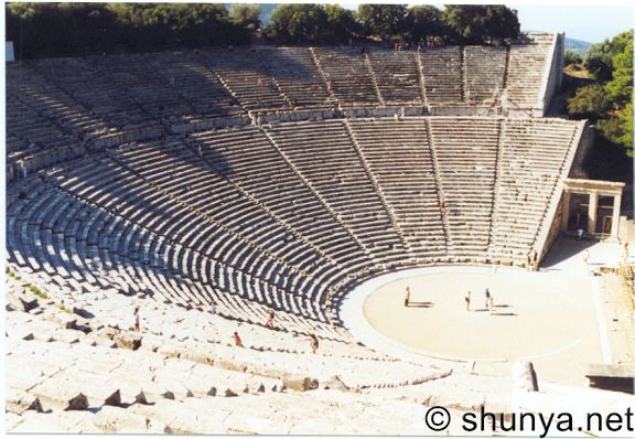
It’s theatre. A Greek theatre, no less. In fact it looks to me extraordinarily like a daubed representation of the magnificent 4th-century BC theatre at Epidauros (been there, recited Sophocles in it – in the Greek, of course). What it most certainly is not, though, is a hippodrome. (Nor is it strictly speaking an amphitheatre, while I’m at it.)


To me this is as daft as calling a pub, say, Aintree, and putting a picture of Anfield or the Liverpool Empire on the sign. It annoys me so much that I am tempted to use Strong Language. But my Mom might read this one day, so I’d better not.
Or maybe I should just get a sense of proportion. . .

Friday, 8 April 2011

A change for the better

The Salisbury Arms, Cambridge

Not every redecoration of a pub has disastrous consequences for the signboard, and here’s an example of one that changes very much for the better. In fact Charles Wells are to be congratulated for their sensitive sprucing up of the Salisbury, retaining all the various quirky nick-nacks and old posters that decorate the interior.
But this blog isn’t about pub interiors, it’s about signs. Since 2008 this is the sign that has hung outside:

It is, barring one minor detail, an excellent reproduction of the arms of the Gascoyne-Cecils, Marquesses of Salisbury, a family with a distinguished political history, going back to William Cecil, 1st Baron Burleigh, adviser to Elizabeth I. The pub itself is probably named after Robert Gascoyne-Cecil, 3rd Marquess of Salisbury, who began the first of his three stints as prime minister in 1885, the year that the pub was established (as the Salisbury Hotel).
The blazon is given in Cracroft’s Peerage as:
Arms: Quarterly: 1st and 4th, barry of ten Argent and Azure over all six Escutcheons Sable three two and one each charged with a lion rampant of the first; a Crescent for difference (Cecil); 2nd and 3rd, Argent on a Pale Sable a Conger's Head erased and erect Or charged with an Ermine Spot (Gascoyne)
Crests: 1st: six Arrows in saltire Or barbed and flighted Argent bound together with a Belt Gules buckled and garnished Gold over the arrows a Morion Cap proper (Cecil); 2nd: a Conger's Head erased and erect Or charged with an Ermine Spot (Gascoyne)
Supporters: On either side a Lion Ermine
Motto: Sero Sed Serio (Late but seriously)
The only thing missing from this in the sign is the red crescent in the 1st and 4th quarter. But that is a minor quibble: the sign is a major improvement on the hopeless psychedelic nightmare that it replaced:

Arms and the woman

What, you might ask, does a sixth-century Frankish princess, nun and founder of a monastery in Poitiers have to do with a pub in Cambridge?
Or perhaps you wouldn’t, maybe it’s just me.
Well anyway, the reason is that the pub is not a terribly long stagger away from Jesus College, founded on the site of the suppressed twelfth-century Benedictine nunnery of St Mary and St Radegund. In fact, the original (and still, I believe official) full name of the college is ‘The College of the Blessed Virgin Mary, Saint John the Evangelist and the glorious Virgin Saint Radegund, near Cambridge’. Although as Radegund had been married to the Frankish king Clotaire I her ‘virgin’ status might be more honorific than literal.
So, that’s the name. What of the sign? Well, once upon a time it looked like this:

The arms depicted are those of Sankt Radegund bei Graz, Styria, Austria, whose blazon is described in the German Wikipedia page as:
Erhöht geteilt; oben in Gold zwei schwarze Wolfsköpfe mit roten Augen und Zungen, unten in Rot ein goldenes Holzschaff.
In English it would be something like: Per fess Or and Gules in chief two wolf heads Sable eyes and tongue Gules in base a wooden bucket Or. (That may not be entirely correct, I’m a bit rusty at writing blazons.)


Very pretty, but unfortunately it has nothing to do with our Radegund, who was born somewhere in Thuringia in central Germany. Sankt Radegund bei Graz is actually named after a completely different Radegund, Radegund von Wellenberg (links to German text), who was fatally injured by wolves. Hence the wolf heads, presumably. What the bucket is for I cannot as yet find out.
Realising this dreadful geographical and biographical error in 2007, then licensee Terry Kavanagh replaced the sign with this modern attempt at depicting a saintly, yet royal figure:
This change of sign even got coverage in the Cambridge Evening News!
And so it remained until 2010, when the new regime reverted to the erroneous heraldic device, albeit with a new sign:

Nicely done, but really, why perpetuate a known error? If it must be heraldic, why not, say, the no less anachronistic Arms of Erfurt in Thuringia, where some claim that the proper Radegund was born, or the Arms of Poitiers, where she is actually buried?
In passing, here is a photograph of Radegund’s tomb in Poitiers that I took last September.

Wednesday, 30 March 2011

This bird has flown

I noticed that this pub had a bit of a makeover recently, which of course meant a change of signboard. Gone is the old one, in the lush style that Greene King used briefly, including for the nearby (and now defunct) Rose and Crown. The colours could have been a lot brighter, but I rather liked it.
The ‘in hand’ bit has now been dropped, and its liberty is now celebrated with this cleaner, more ‘bistro’-style thing:
Now I may be mistaken here (rare, but not entirely impossible), but I thought the whole point of signboards was that they should be eye-catching and stand out from the crowd. There are so many brightly coloured birds out there, so why GK’s designers seem to have taken the well-camouflaged dunnock as inspiration for the colour scheme is a mystery to me.

Monday, 28 March 2011

County matters


The County Arms
Sitting as it does opposite Shire Hall, the name requires no further explanation. But what caught my eye, and both inspired my interest in signboards and what they depict, and rekindled a boyhood interest in heraldry, is that the arms on the board and the arms on the bracket are different. I wanted to find out why.

And the reason? The arms of the county have themselves changed over the years.


First, the arms on the signboard. These are the present arms of Cambridgeshire County Council, granted in 1976 following the incorporation of Huntingdon and Peterborough in 1974. The full blazon is given on Civic Heraldry of England and Wales as follows:
ARMS: Or three Palets wavy alternating with two Palets Azure a Bordure Gules flory on the inner edge Or; the Shield ensigned by a Mural Crown Or.

SUPPORTERS: On either side a Great Bustard proper the exterior leg resting on a closed Book Gules garnished Or pendent from the neck of the dexter by a Cord Argent two Keys in saltire wards uppermost and outwards Gules and from the neck of the sinister by a like Cord a Hunting Horn mouth to the dexter Or.

MOTTO: 'Corde Uno Sapientes Simus' – With one heart let us be men of understanding.
The wavy lines (which you have have to look pretty hard to see any waviness to on this representation) represent the three principal rivers of the county (the Cam, the Nene and the Ouse). The alternating straight lines represent the many straight man-made fenland drains.
The fleurs-de-lys (‘flory’) in the border are a relic of the earlier ‘double tressure flory counterflory’, derived from the Royal Arms of Scotland, representing the fact that the earldom of Huntingdon was held by Scottish monarchs in the twelfth and thirteenth centuries. (Henry of Scotland, son of King David I of Scotland, inherited the title in 1130 via his mother, Matilda, daughter of Waltheof, 1st Earl of Northumberland and 1st Earl of the Honour of Huntingdon and Northampton. The title was then settled on his descendants until the line became extinct with the death of John of Scotland in 1231, when it was annexed to the Crown.)
The great bustard was for a long time extinct in England, but has recently been reintroduced. The books these supporters stand on represent the University of Cambridge. The cross keys hanging round the neck of the left-hand bird represent the Keys of St Peter and stand for the Soke of Peterborough; the hunting horn hanging from the neck of the other supporter is a canting reference to Huntingdonshire.
The motto combines the earlier motto of Huntingdon and Peterborough City Council (‘Cor Unum’) with that of the Cambridgeshire and Isle of Ely County Council (‘Sapientes Simus’).
The arms on the bracket are now in a rather sorry state, but depict the original arms of Cambridgeshire County Council, in use from 1914 to 1965.
Arms: Azure, an Bend wavy Or overall a double Tressure flory counterflory Or.
Motto: Per Undas Per Agros (‘By waves and by fields’)

The gold wavy line on blue represents the River Cam and the wealth of the trade it bore to Cambridge. The double tressure and the bustard supporters have already been mentioned. Why it has a helmet with crest and mantling, I know not.
Sources: