Friday, 12 August 2011

Imperial Travesty

After being known as the Globe since at least 1869, this pub gained a new name when it joined the same stable as the Empress in late 2010. Nothing wrong with pubs changing their name, of course – well, so long as the new name is appropriate and not silly. (Slug and Lettuce, anyone? No, thought not.) And I can see why the new ‘brother’ pub of the Empress should be renamed to mark its adoption, even if it’s not as venerable a pub name as the Globe.
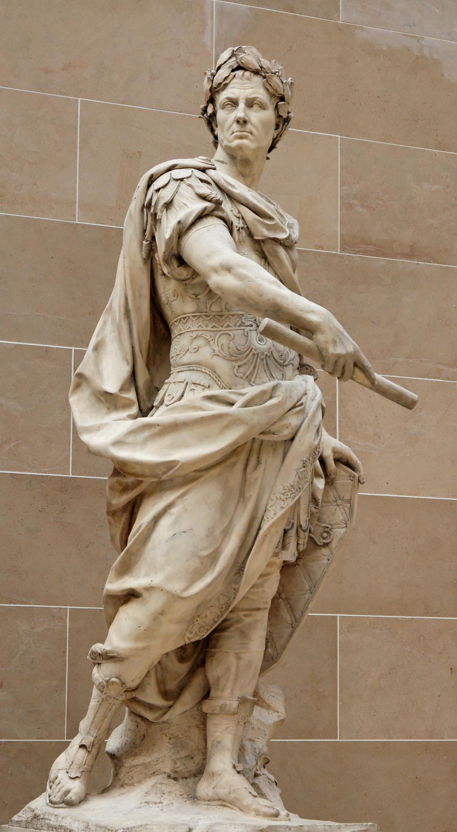
So, which emperor to choose? Well, as the Empress takes its name from Queen Victoria, Empress of India, her successors might be good candidates. But aside from George V, who actually went to India to be crowned Emperor, none have particularly ‘imperial’ associations to the modern mind. There is the Emperor Napoleon, of course, but that probably wouldn’t go down too well. Probably someone Roman, then, they had emperors, didn’t they? How about this one?
This is a fancifully flattering statue of Julius Caesar by Nicola Coustou (9 January 1658 – 1 May 1733), now in the Louvre. Everyone knows about Julius Caesar, don’t they? Veni, vedi vici, invaded Britain, Gallia est omnis divisa in partes tres, knobbliest Roman of them all, et tu, Brute, ‘Infamy, infamy, they’ve all got it in for me’ and all that. He’ll be ideal, won’t he?
One teeny-weeny problem, though: Julius Caesar was never emperor. (He may have been granted the title ‘imperator’, but that is not the same as our understanding of the word ‘emperor’.)
Oh, and I always thought that the imperial colour was purple, not this horrendous green.

Oops Acropolis!

The Bath House (formerly The Bath Hotel) sits in a Grade II listed 17th-century building, with reworked 18th-century frontage. So when Greene King decided to replace the former generic signboard, it must have seemed so obvious to go for something classical – this is Cambridge, after all. Perhaps a Roman bath, then?
Not a bit of it. What we actually have is this:
It’s a detail from the south-east corner of the temple of Athena Nike on the Athenian Acropolis. Not a bath-house, not Roman, and nothing to do with the building or Cambridge whatsoever.
If (polite) words failed me about the Hippodrome, March, I am left completely speechless by this idiocy.

Wednesday, 27 July 2011

Through the Looking-Glass


The queen in question is, of course, Victoria, and this sign is based on a portrait of the young queen painted by Sir Frances Grant in 1843.
It’s nicely painted, but for some reason it has been done in mirror image, as the direction of the sash gives away (the Garter sash or riband should be worn over the left shoulder, not the right).

Monday, 4 July 2011

County doesn't seem to matter after all

An update to the very first post on this blog, about the sign that started it all off. Because there is a new one:
I’m not very impressed with it. First, gone is the old Arms of the old county on the bracket, to be replaced by some rather clunky Everards branding. Admittedly it was looking more than a little weather-beaten, but I know which of the two I would rather have on there.
Then there’s the picture itself:
This looks like a fairly faithful reproduction of what was there before, except that the colours have changed, and become more intense. This means that what should be yellow (Or) is now more of a Dale Winton orange, which is not an heraldic tincture. And the crossed keys around the neck of the dexter supporter should be silver (Argent) and gold (Or), although that was wrong in the previous sign as well.

Small details, perhaps. But would Everards be so cavalier if it were the Arms of Leicestershire CC rather than Cambridgeshire?

Wednesday, 15 June 2011

Seeing double

In my last post I commented on a Greene King sign that had had a degree of thought put into it. More often than not, however, especially with common names, they resort to stock images. This means that a number of pubs have more or less identical signs. For instance . . .
OK, there’s no direct route and there’s a river between them, but still, as the crow flies they're barely three-quarters of a mile apart. Didn’t anyone notice?

Tuesday, 7 June 2011

Health to the sign-painter

I like this sign, a lot of thought has gone into it. Which is unusual for Green King.
As I’m sure everyone can recognise, it is made up of elements of William Hogarth’s Beer Street (the slightly less-famous companion to Gin Lane). That in itself is enough to endear it to me, but there’s more to find in the detail.
In the original, although hard to make out, the sign-painter is putting the finishing touches to a sign for an alehouse or tavern called ‘Health to the Barley Mow’, a detail that is preserved in this sign:
However, the picture on the sign is different. In the original, we can just make out a circle of happy farm labourers dancing around a hayrick at the end of a successful harvest, with another ‘reveller’ (as they call them in newspapers these days) standing atop it.
Here we have a rider, who looks to be masked like a highwayman, taking a drink from a stirrup cup from an attending servant.
I presume this is a reference to Dick Turpin: we’re not far from Huntingdon, where he certainly did hang out for a while, and the old Great North Road, scene of his mythical ride from London to York. A number of old inns nearby claim that he used to frequent them, but I can’t find any reference to a claim on the part of this one. It is reputed to be haunted, but not by Turpin.
Some other points in passing. There are two versions of the original print, and the second is the better known. In it, the burley blacksmith is raising in his left hand a haunch of good British mutton or ham. I prefer the first version, in which he is ejecting a scrawny Frenchman! Here he’s just holding a rolled-up piece of paper, for no obvious reason.
The Union Flag flying from the church (St Martin-in-theFields) is the post-1801 version, with the Cross of St Patrick included. Beer Street was published in 1751, and Hogarth died in 1764, so this is a slight anachronism. But that's a very minor quibble in what is otherwise a very captivating and thoughtful signboard.

Update:
Sadly, in October 2011 this most excellent of signs was replaced by this corporate blandness.


Details about this sign here.

What the Fawkes?!

The ‘King’s Head Tavern’, Midsummer Common, Cambridge
OK, this isn’t a ‘real’ pub sign, belonging instead to one of the bars at this year’s Strawberry Fair. But even so, what the hell is it meant to be? Charles I wearing a V for Vendetta-style Guy Fawkes mask? Is someone trying to be clever? Tavern, indeed. . . It's a marquee!
I went to the real ale bar instead. And ended up drinking Pickled Pig cider because there was no dark beer on offer and I can't bear all that hoppy, citrus-y Oakham stuff that seems to be all the rage at the moment.

Update: The King's Head, Yarmouth, IoW has a very similar sign, only without the Fawkes/V for Vendetta nonsense.